Hero - Little Bakery

Little Bakery

Project Overview

About the Product
Little Bakery is a fancy bakery in town that serves freshly baked goods. Little Bakery wants to promote their new products with a wide range of customers as their business is growing. Hence, the idea of going online to serve customers of busy schedules and distant places was born. Along with it, Little Bakery is also offering customizations, delivery options, and events and classes for their customers.
Project Duration
September 2023 – October 2023
The Problem
Little Bakery’s customers have to queue up outside the store to get the goods. This results in lost or frustrated customers. Little Bakery also wants a way to market new products and expand their customer base.
The Goal
Design a website for Little Bakery, that would allow users to place and collect their orders according to their likings, while also promoting new items and other initiatives the bakery has to offer.
My Role
UX Researcher and Designer for a website for Little Bakery, from concept to delivery.
My Responsibilities
Conduct interviews, paper and digital wireframing, low and high-fidelity prototyping, conducting usability studies, accounting for accessibilities, and iterating on designs.

Understanding the User​

User Research: Summary
Detailed research including observations, journey maps, and interviews were done in order to understand the pain points of target users I was designing for. A primary user group identified through this were people with busy schedules who can’t afford to waste time waiting in line to purchase goods.

This user group confirmed initial assumptions about Little Bakery’s slow growth, but research also revealed that this is not the only reason. Other user problems include not having ordering and delivery service, multiple payment options, and lack of reviews and dietary descriptions for items on display.
User Research: Pain Points

Flexibility

No means of ordering, besides a physical store that needs to queue for hours.

Payment Options

No other payment option besides cash, which isn’t stated beforehand.

Resistance

Users were hesitant to try new products without knowing the ingredients or taste.

Persona & Problem Statement
Problem Statement
Aoki Denji is a busy college student who needs a way to order Little Bakery goods early because of insufficient stock by the time he arrives to the store.
Aoki Denji
Aoki Denji

Age: 22
Education: Online College
Hometown: Tokyo, Japan
Family: Parents & 3 siblings
Occupation: Full time student

I love adventures, and I'm ready to explore the world around me!

Goals
  • To experience new things the neighbourhood.
  • To try new cuisines and famous dishes in new neighbourhood.
Frustrations
  • “As someone who is still new to this place, I find purchasing items stressful due to the conversion rate and currency.”
  • “It’s overwhelming when I enter shops and I’m expected to know everything without prior knowledge.”
  • “I wish there was a slower paced environment where I can make choices at my own rate.”
Denji is a recent immigrant to Malaysia who is enrolled in online college classes and is also taking piano lessons at night. He can converse in English, but finds it difficult to read well. He also encounters difficulties when it comes to payments as the conversions are still new to him. Denji wants to explore what his neighbourhood has to offer, while being in his comfort zone and without impacting his commitments.
User Journey Map

Persona: Aoki Denji
Goal: Visit Little Bakery and purchase items

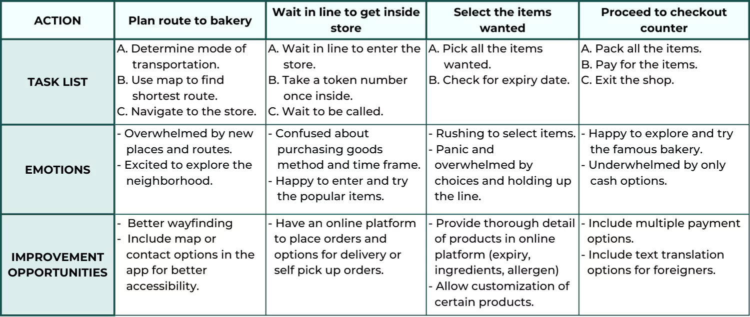
I created a user journey map of Denji’s purchasing experience to identify possible pain points and improvement opportunities.
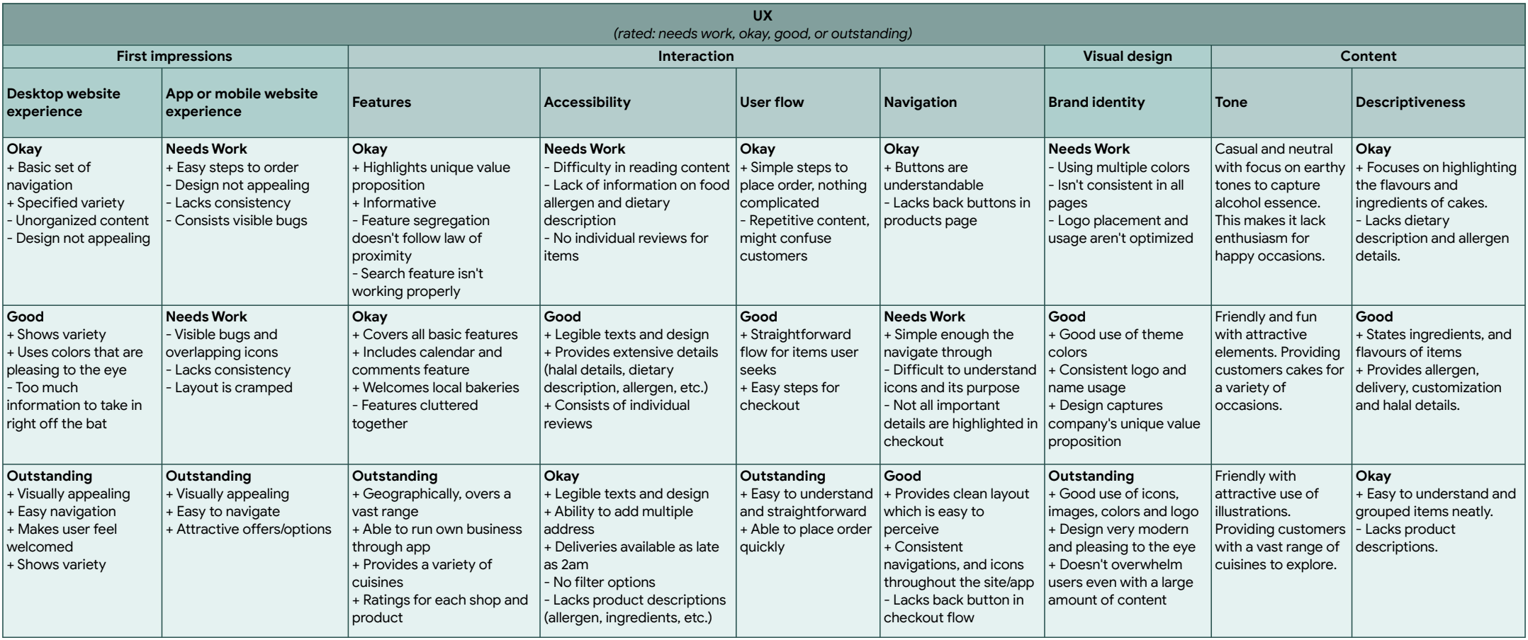
Competitive Audit
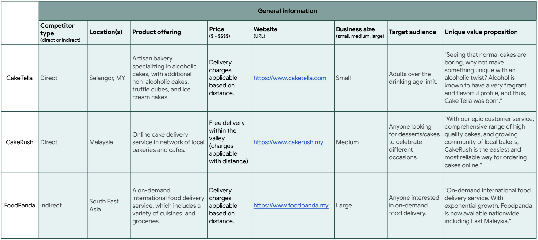
Compared the ordering and accessibility features of each competitors’ online bakery site.

Starting the Design

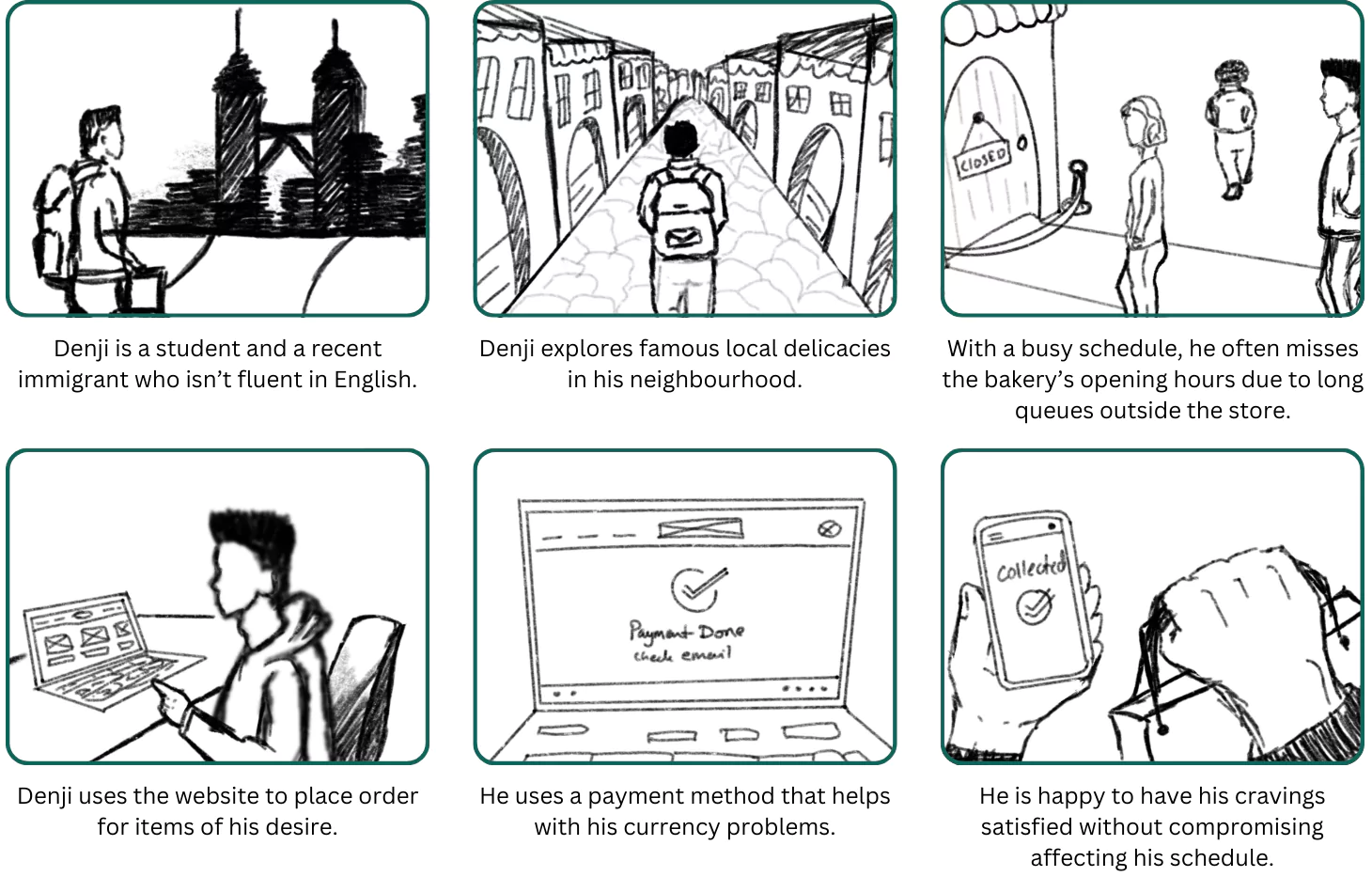
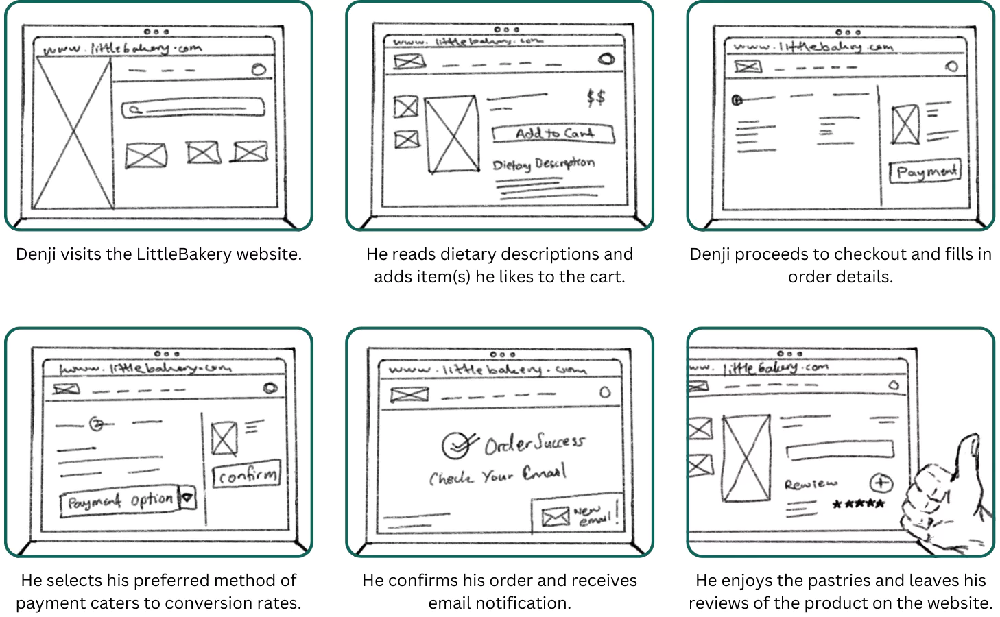
Storyboard
Big Picture: Journey of a recent immigrant who is excited to try a famous local bakery he’s heard a lot about with the help of its online presence for placing order.
Close Up: Utilization of the bakery website for customers to place and customize orders on-the-go.
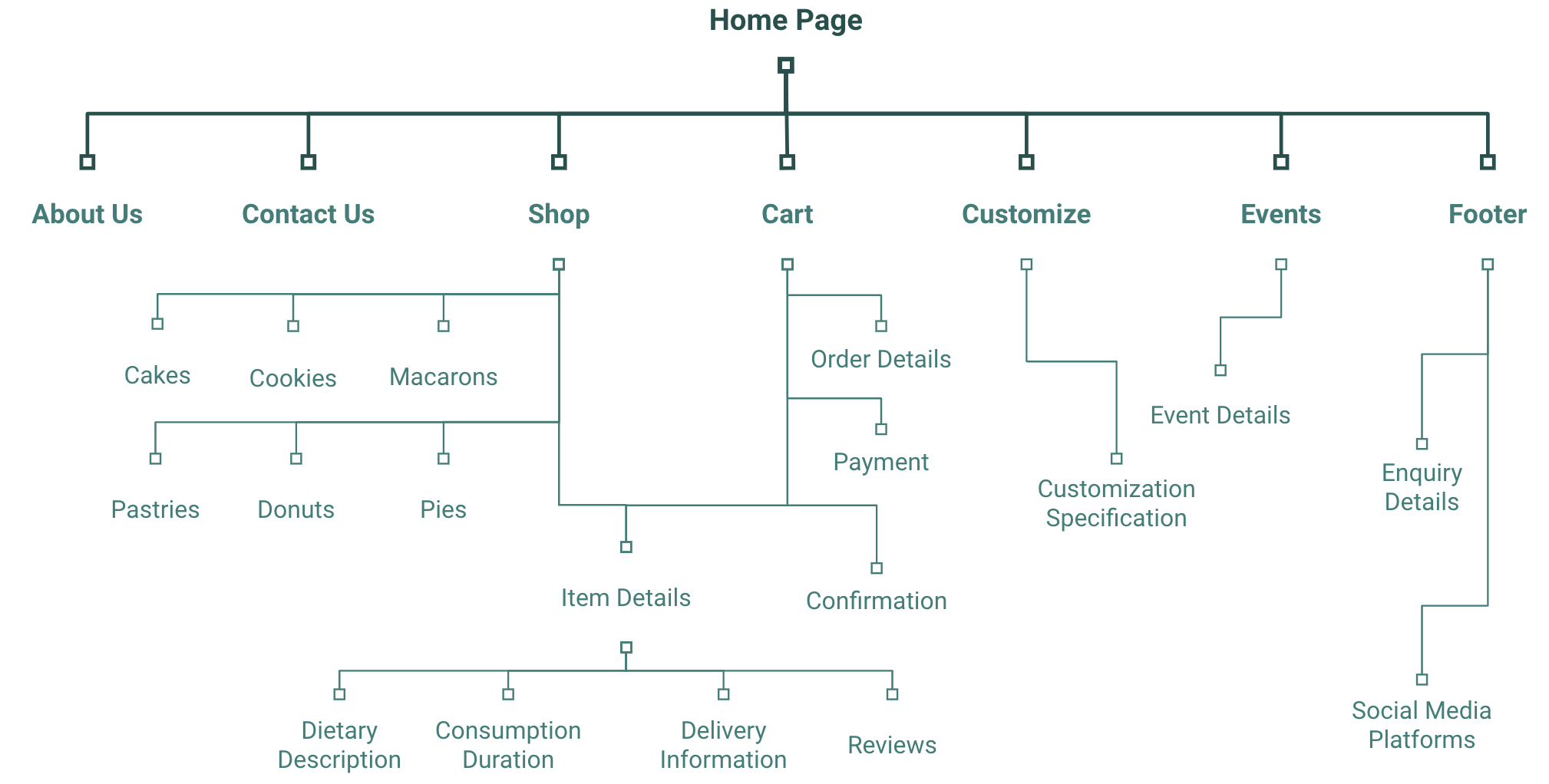
Sitemap
Difficulty in placing an order was a main pain point for users, so I used that knowledge to create a sitemap. The goal was to create a simple yet strategic architecture that would allow customers to place orders quickly and easily with the least number of steps.
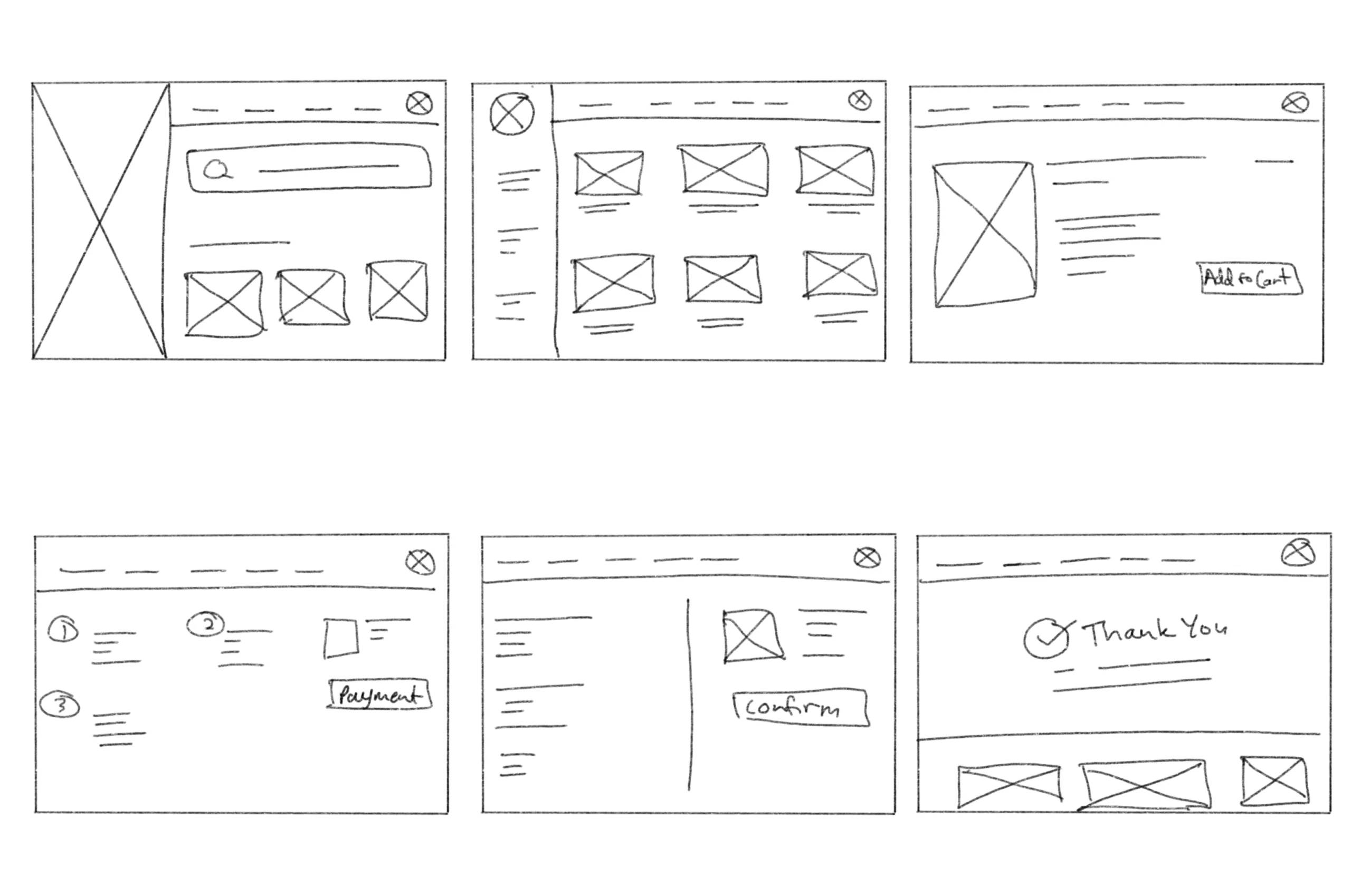
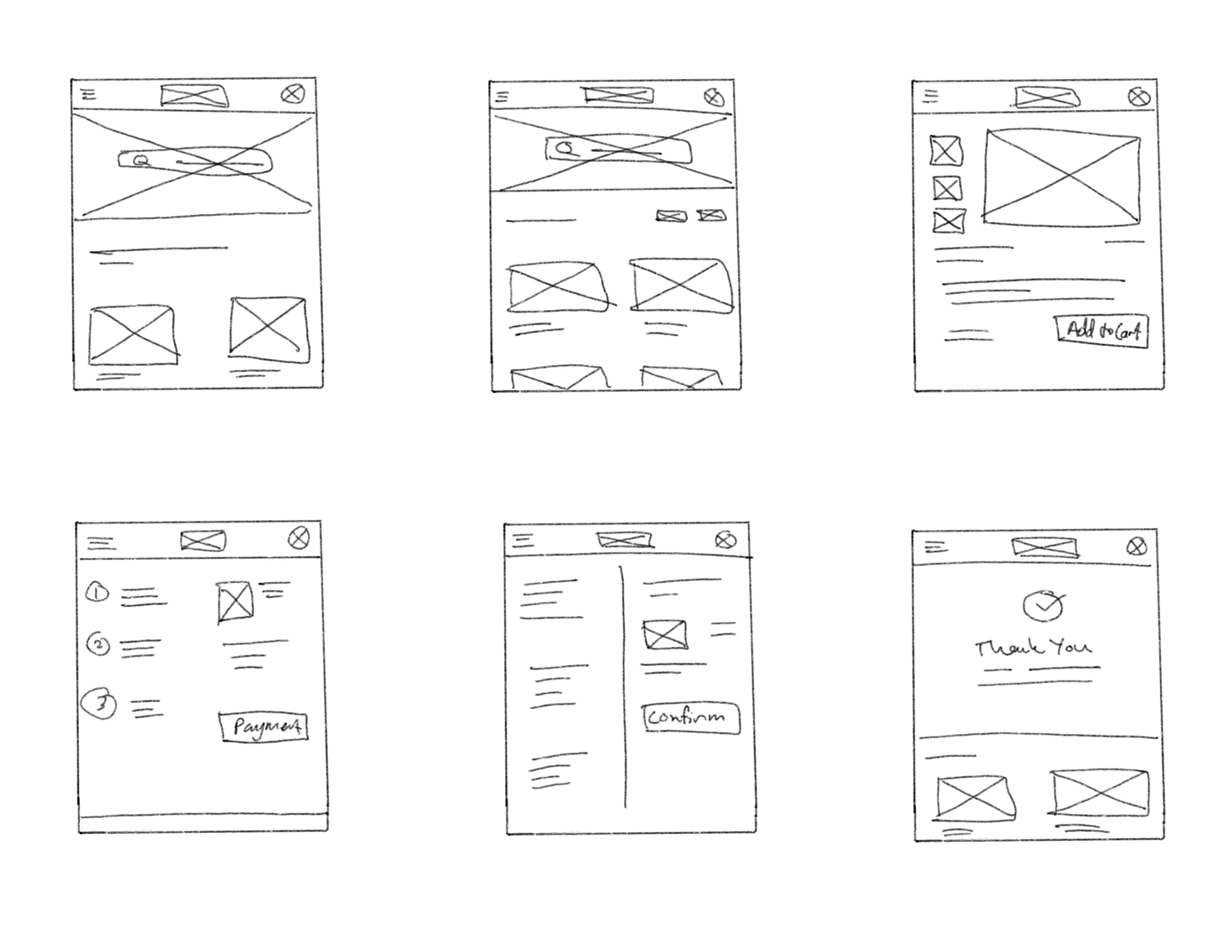
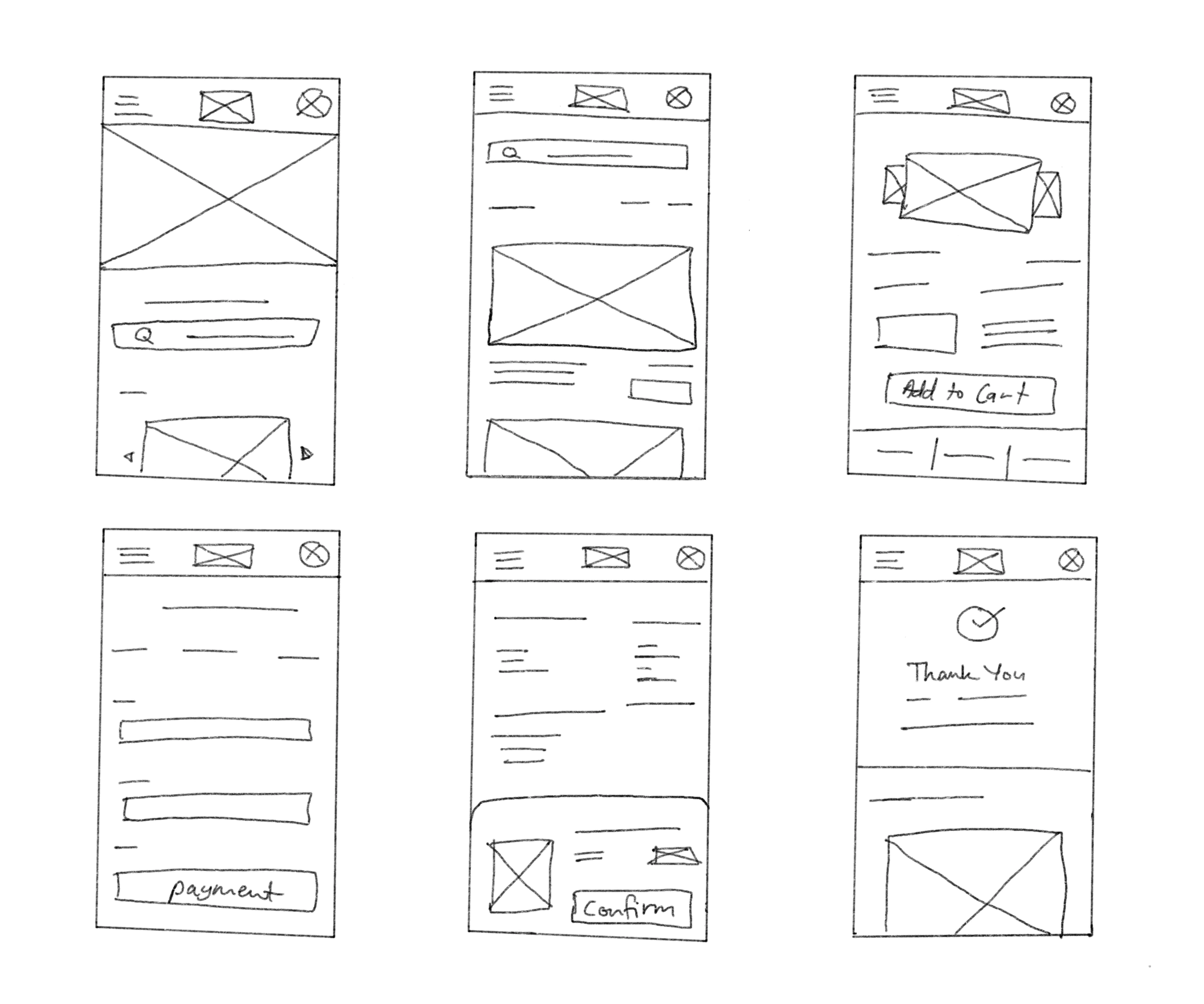
Paper Wireframes
I sketched out paper wireframes for each screen for the purchasing process of Little Bakery goods. The priority here was to minimize the steps taken to place order through the site. Sketches were made to be responsive to allow users to place order from the comfort of their home or on-the-go.
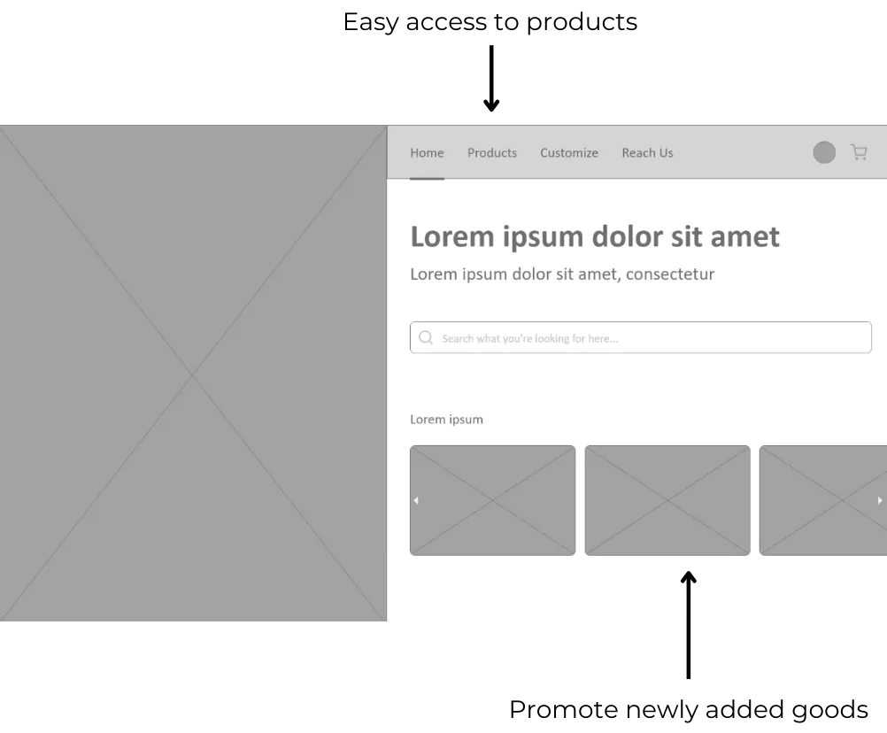
Digital Wireframes
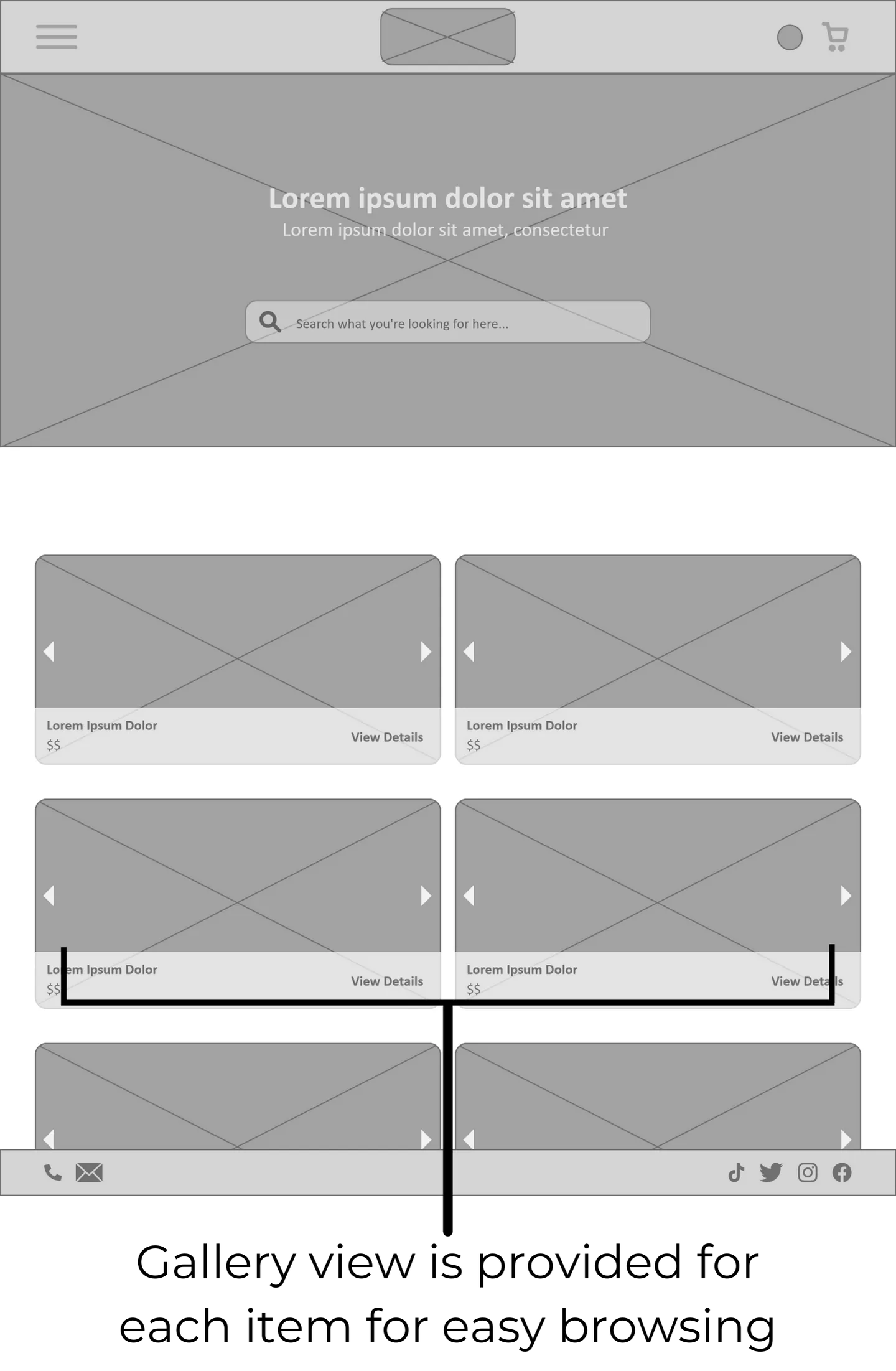
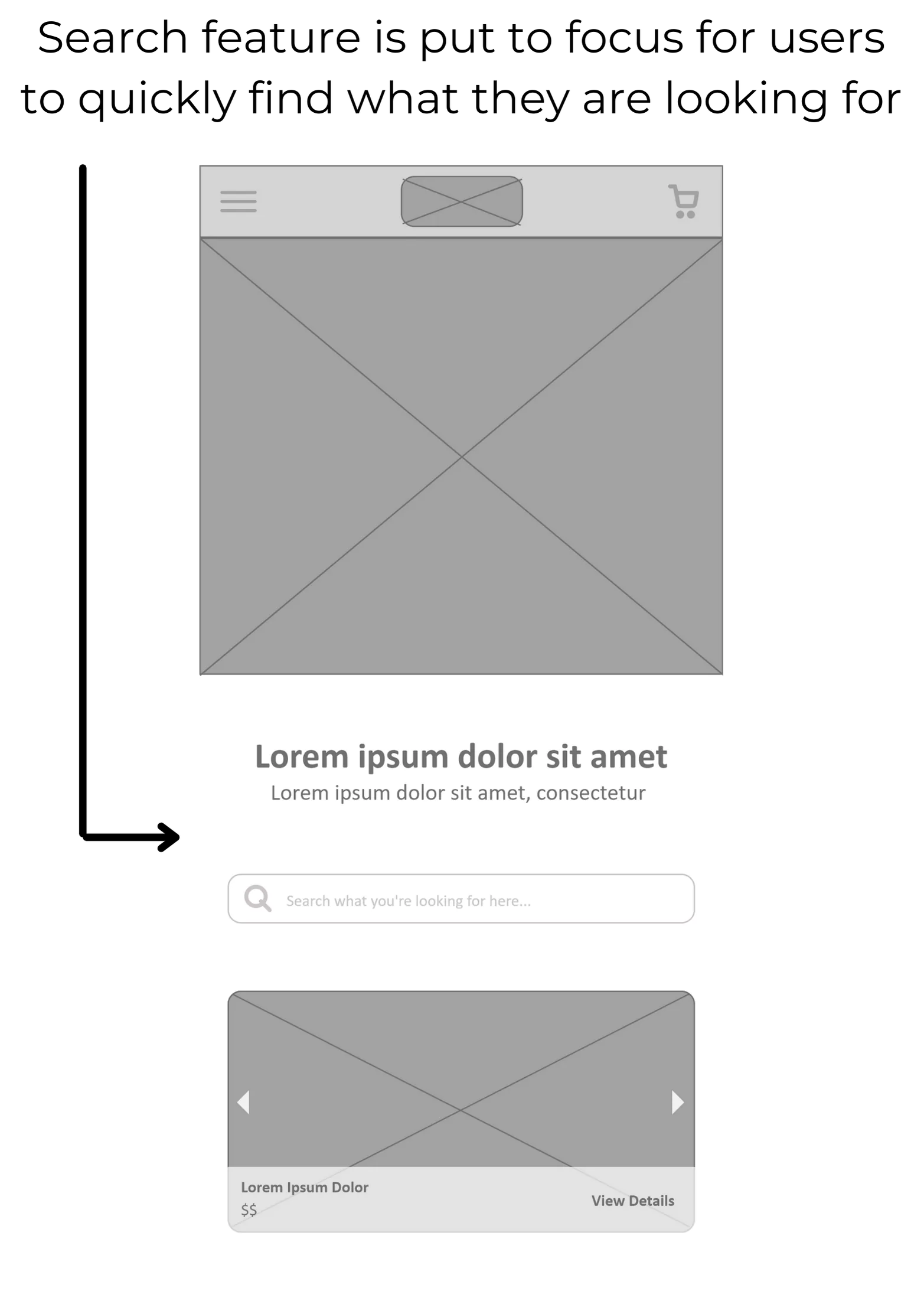
Moving from paper to digital wireframes made it easy to understand how the website could help solve user pain points and enhance the user experience. Prioritizing the goals and user pain points was essential in creating these wireframes.
Low-Fidelity Prototype
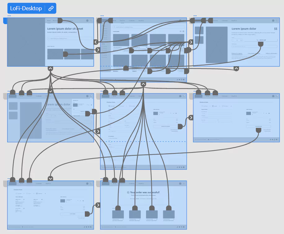
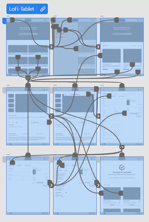
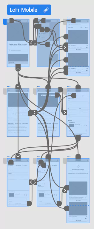
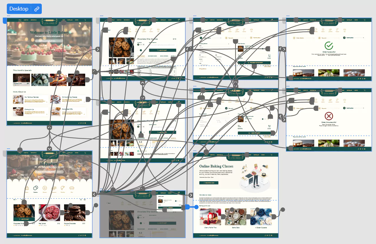
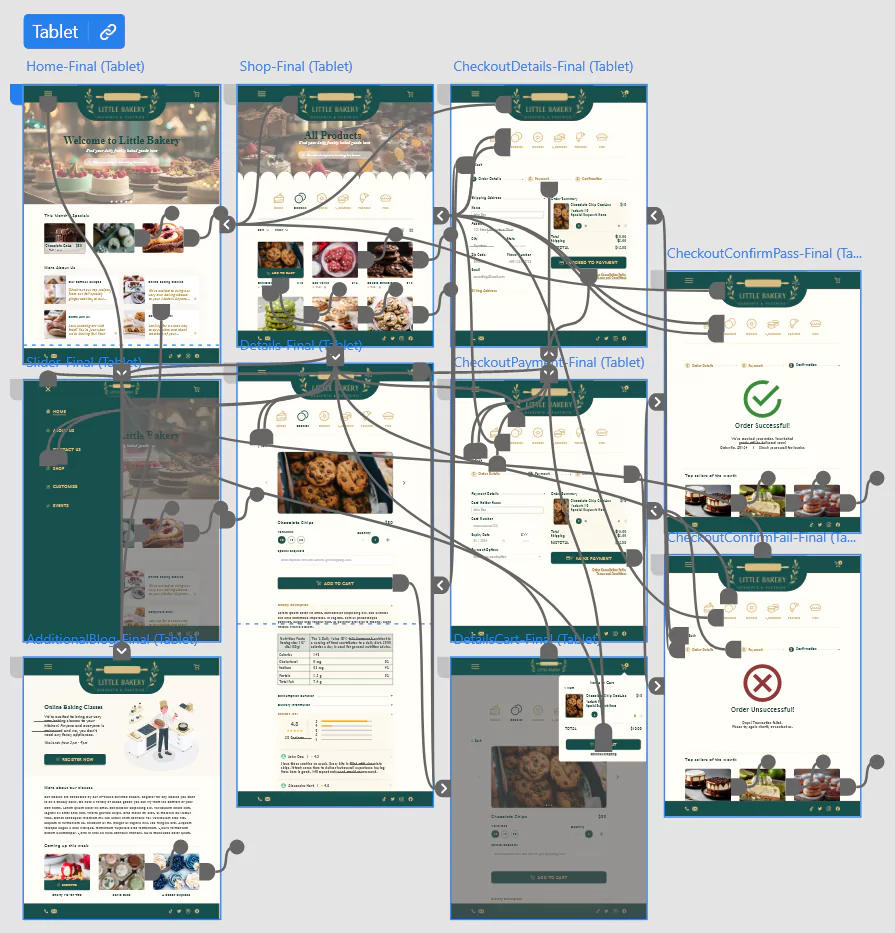
Using the completed set of digital wireframes, I created a low-fidelity prototype. The primary user flow I connected was mock place order, so the prototype could be used in a usability study.

The final low-fidelity prototype of Little Bakery is available for viewing at Desktop, Tablet & Mobile.

UX Research

Usability Study: Parameters

Stakeholders

Bakery Management, Customers, Community, Suppliers, Investors

Research Questions

5 questions (Orders, Payments, Search & Navigation)

Key Performance Indicators (KPIs)

Time on task, Navigation vs. Search Use & System Usability Scale (SUS)

Participants

5 participants
(LittleBakery Gift Cards as Incentives)

Study Type

Unmoderated usability study

Duration

20 - 30 minutes

Location

Malaysia, Remote

Usability Study Findings
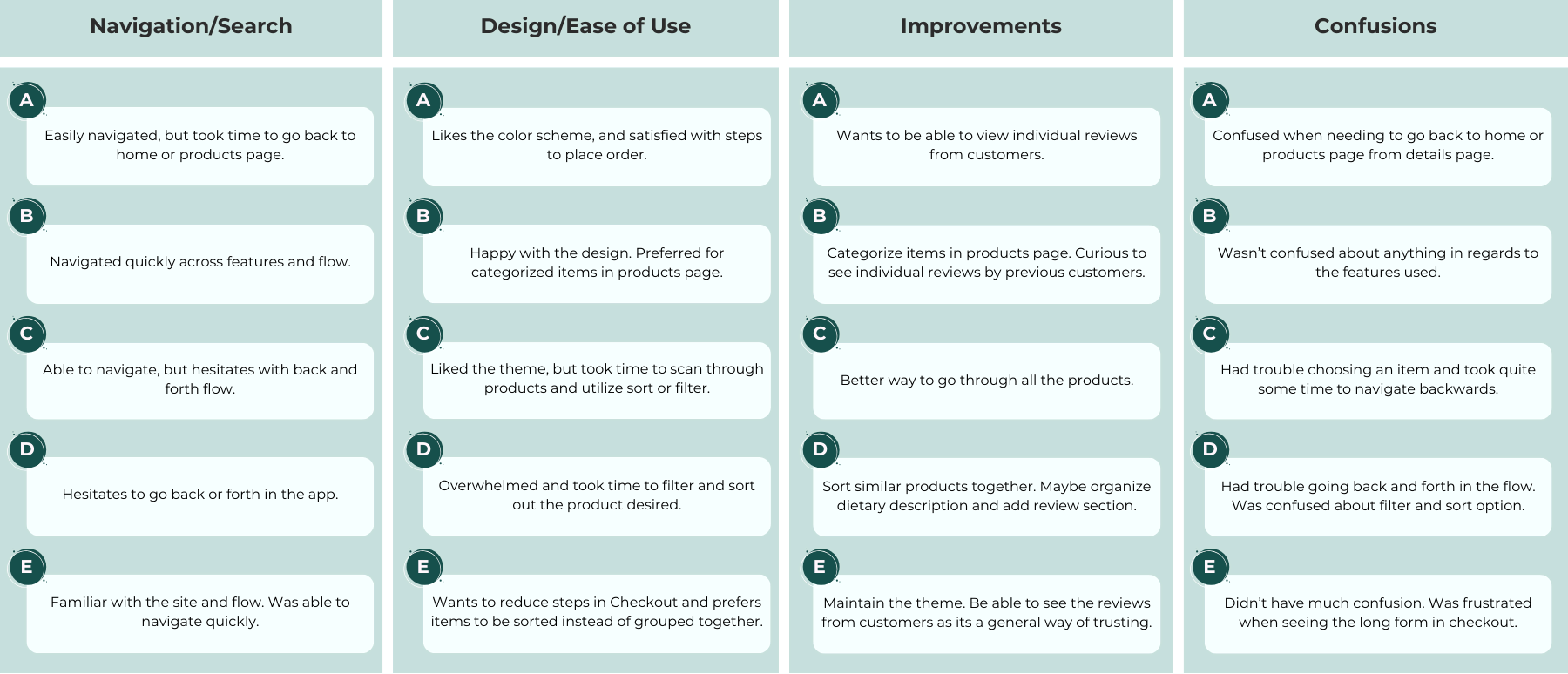
Affinity Diagram: Feedback gathered and organized from 5 participants, identified as Participant A, B, C, D, and E, from the usability study.
Pattern Identification
1
It was observed that 3 out of 5 participants hesitated to navigate back and forth between the features. This means that quite a number of users find it difficult to navigate the site smoothly.
2
It was observed that 3 out of 5 participants took time to find items they like. This means that users are frustrated when finding intended items in the products section.
3
It was observed that 4 out of 5 participants asked about individual reviews. This means that most users are expecting individual reviews for each item.
4
It was observed that 4 out of 5 participants find features of the site easy to use. This means that most users are satisfied with the steps taken to place an order, but not all.
Insight Identification
1
Based on the theme that: navigation is difficult, an insight is: users need a clearer indication on how to navigate back and forth between features.
2
Based on the theme that: items displayed are overwhelming for users, an insight is: users would find what they are looking for easily when items are categorized.
3
Based on the theme that: a large number of users ask about individual reviews, an insight is: users trust feedback from the community as it shows the item of purchase in real life, which users can resonate with.
4
Based on the theme that: the design and features are easy to use, an insight is: users are satisfied with the current design theme but improvements can be made to reduce checkout steps and maintain consistency.
1
Navigation
Users were confused about flexible navigation in the order placing flow.
2
Categorization
A number of users were overwhelmed by the way products were displayed and preferred it to be categorized.
3
Information
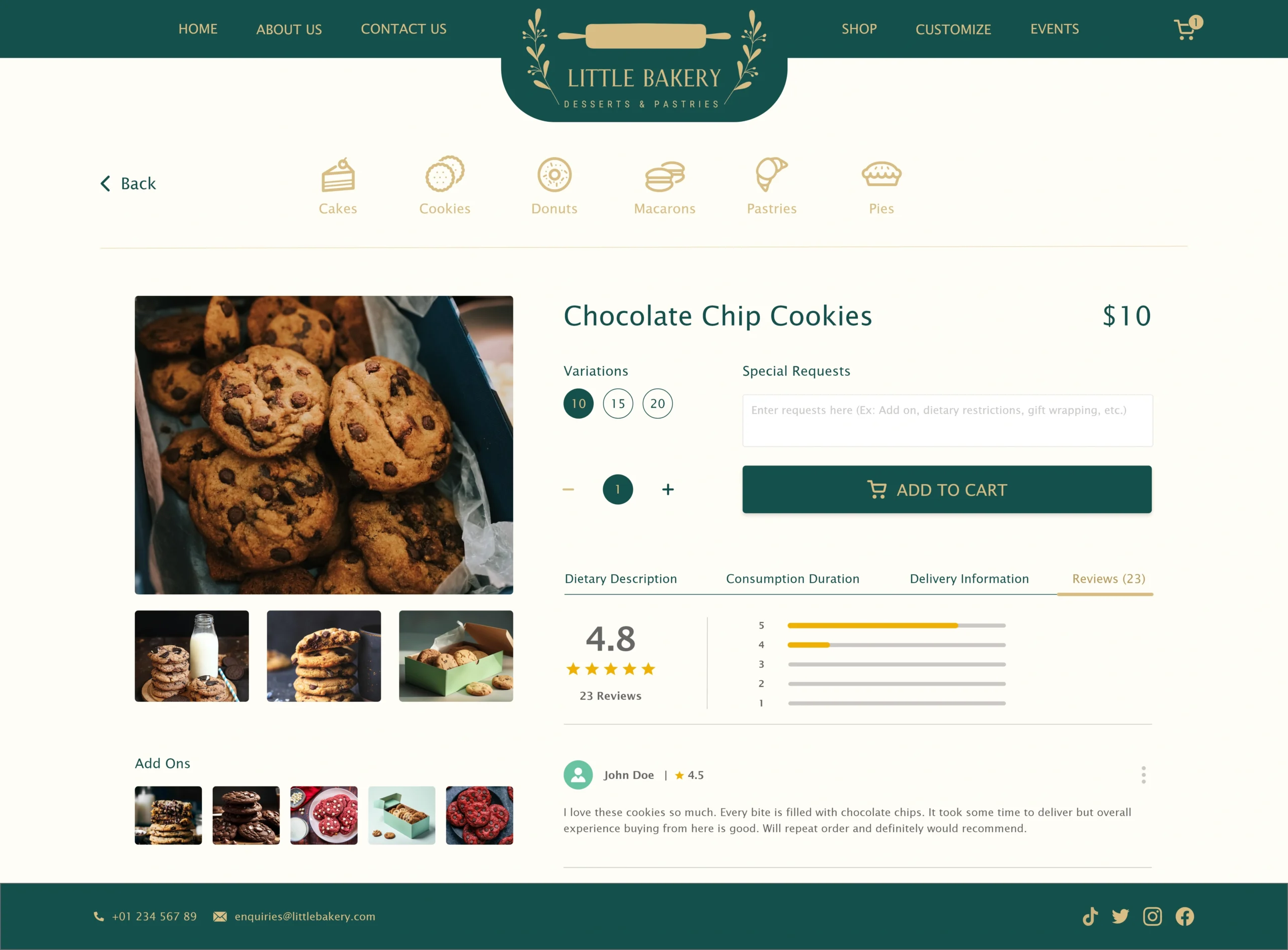
Users mentioned wanting individual reviews for each item to resonate with previous customers and better understanding of item consumption in real life.

Refining the Design

Mockups
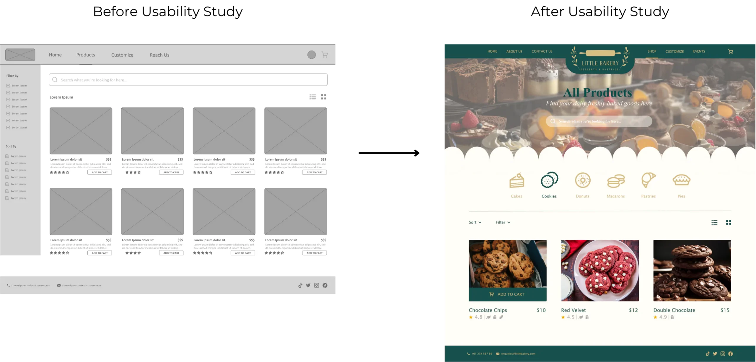
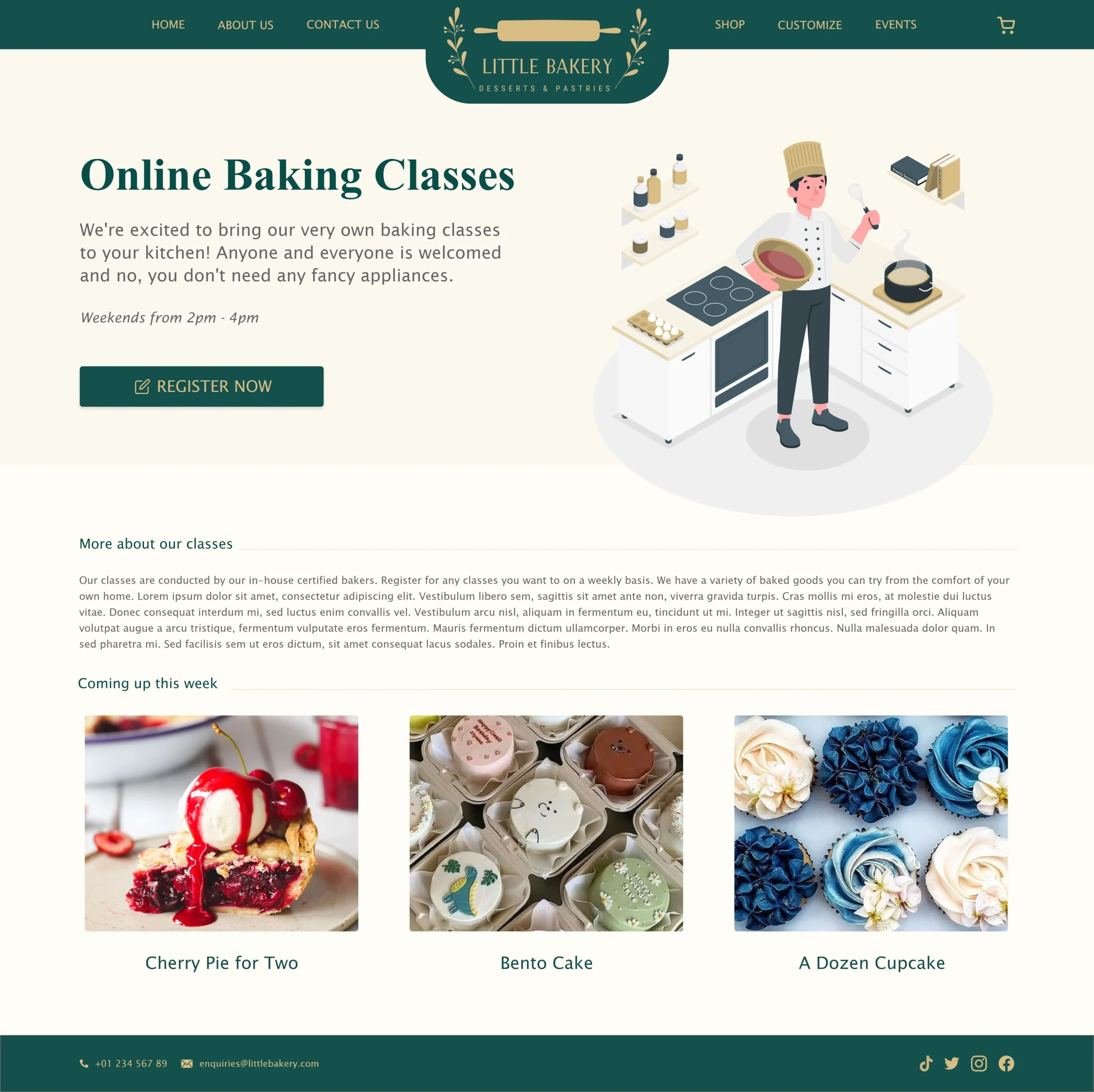
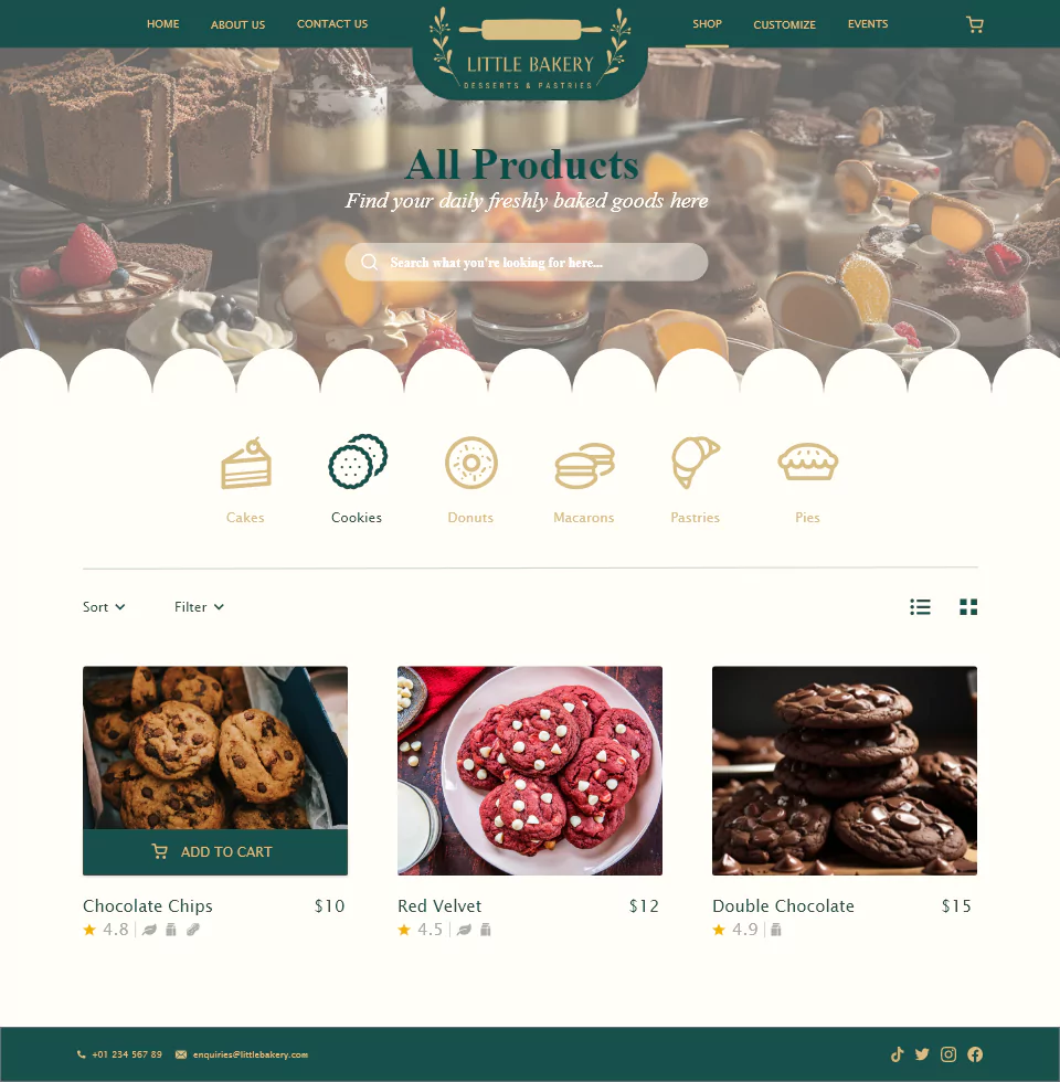
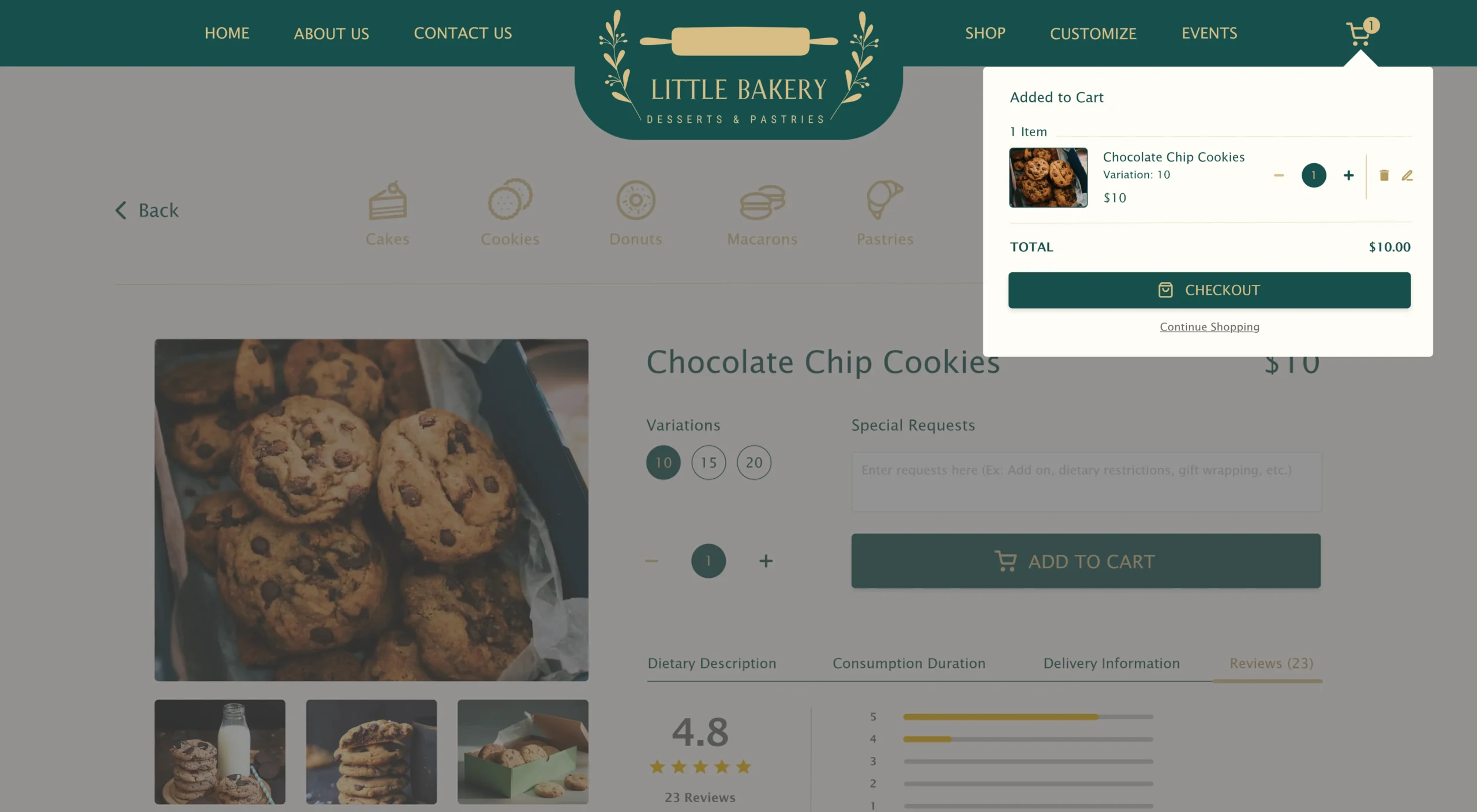
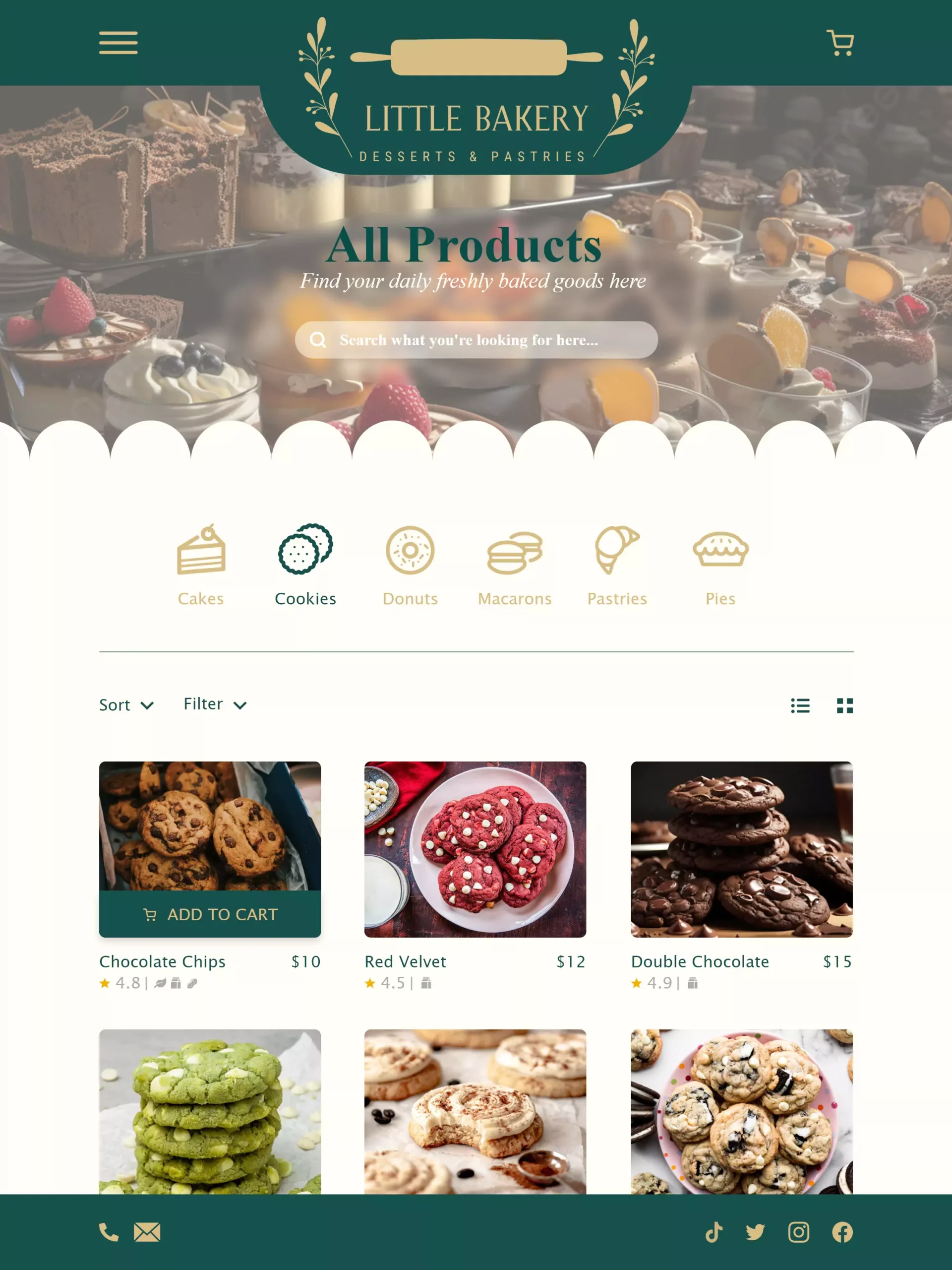
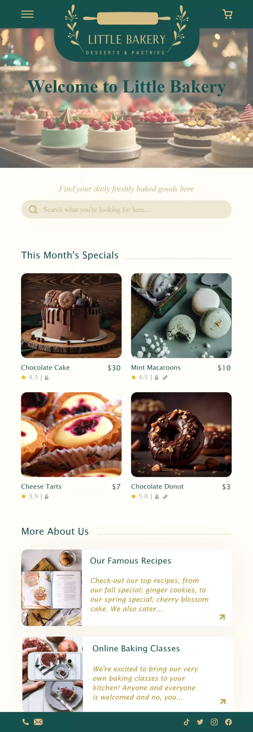
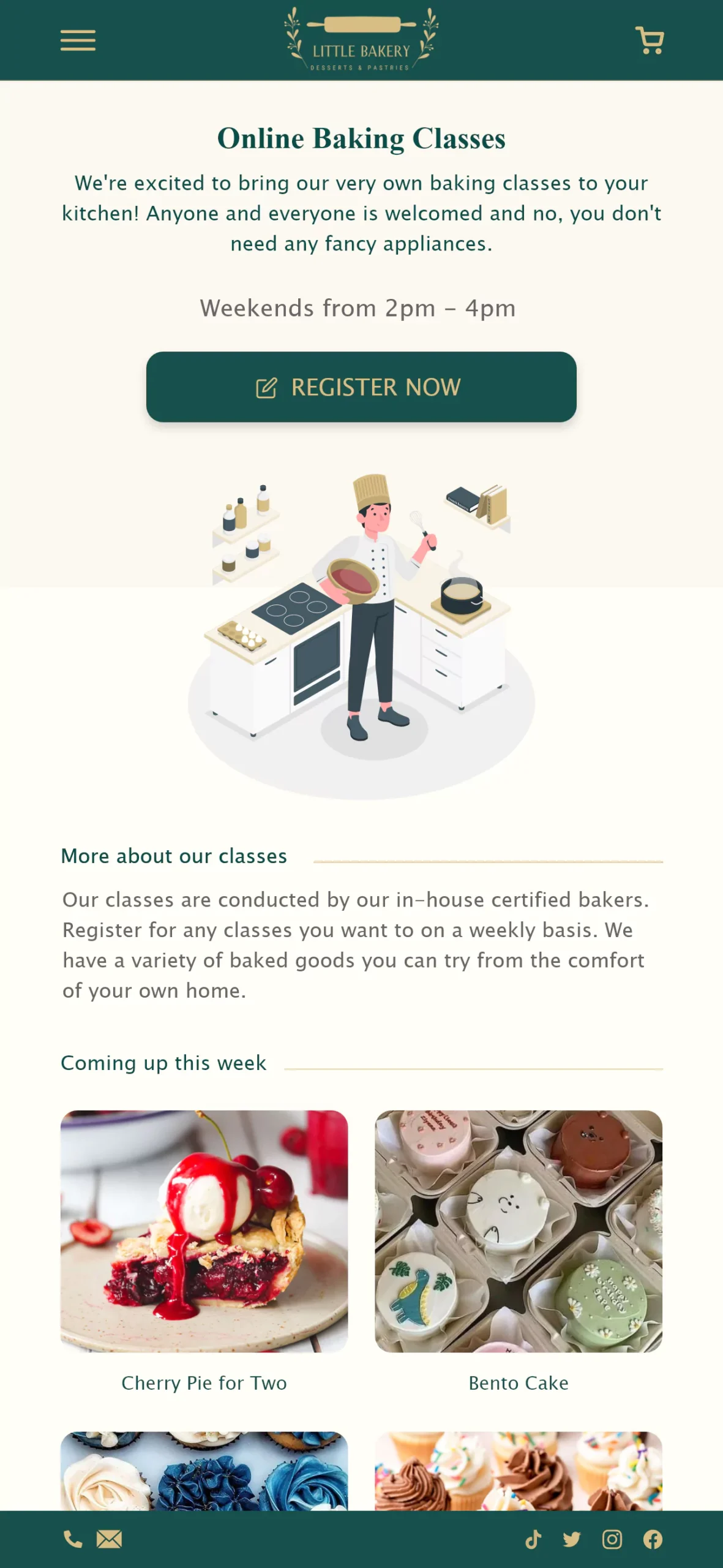
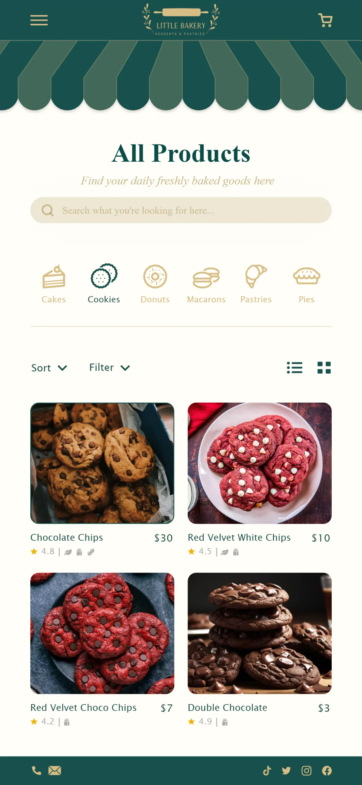
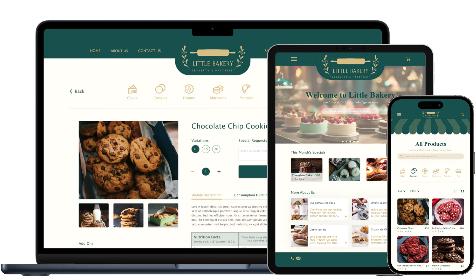
Gathering insights from usability study, I made some changes to the Products page. The items sold in Little Bakery is now categorized in its own section and is placed on top of the top for easier viewing. This way, users can navigate quickly to their desired products. The search, filter and sort features remained to provide users flexibility.
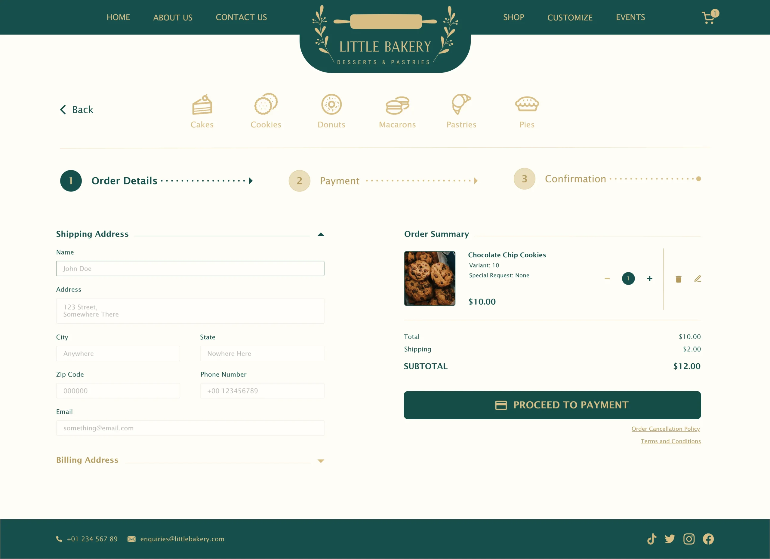
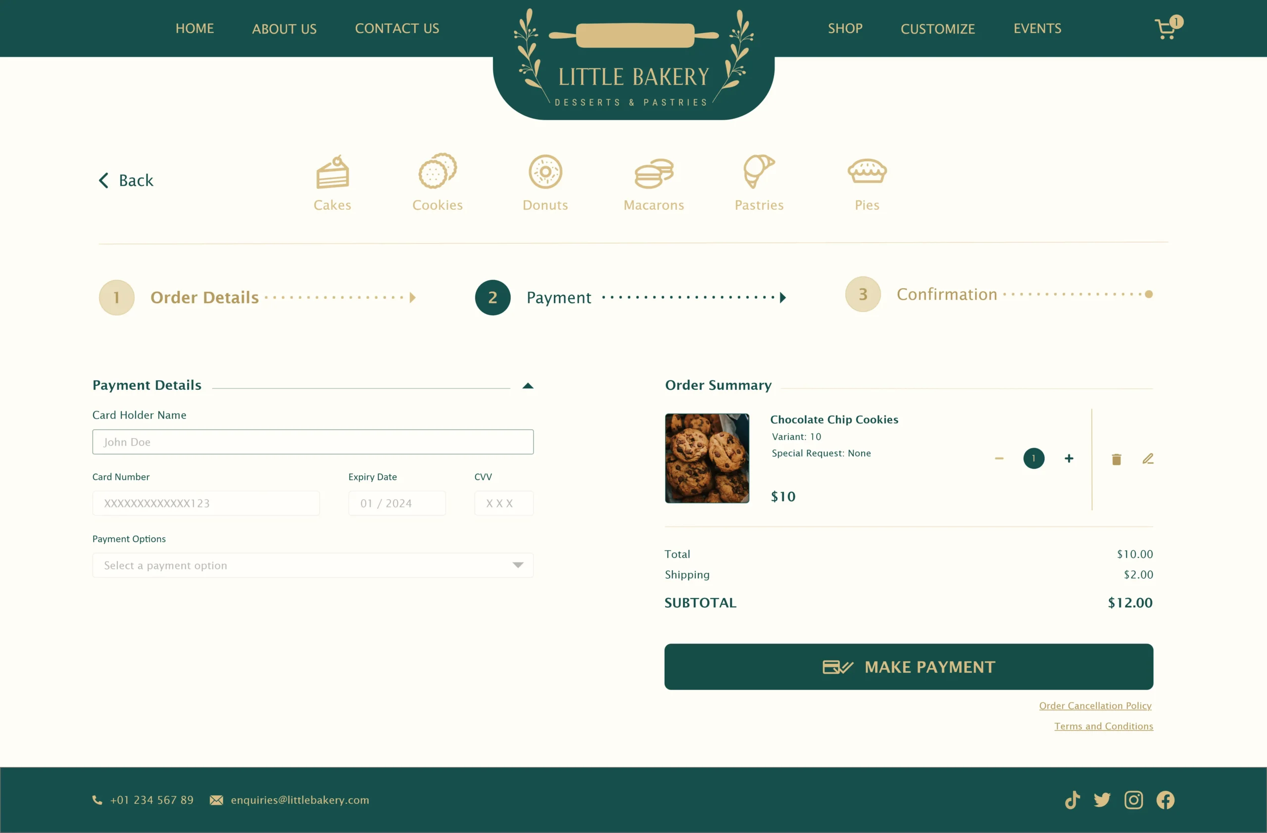
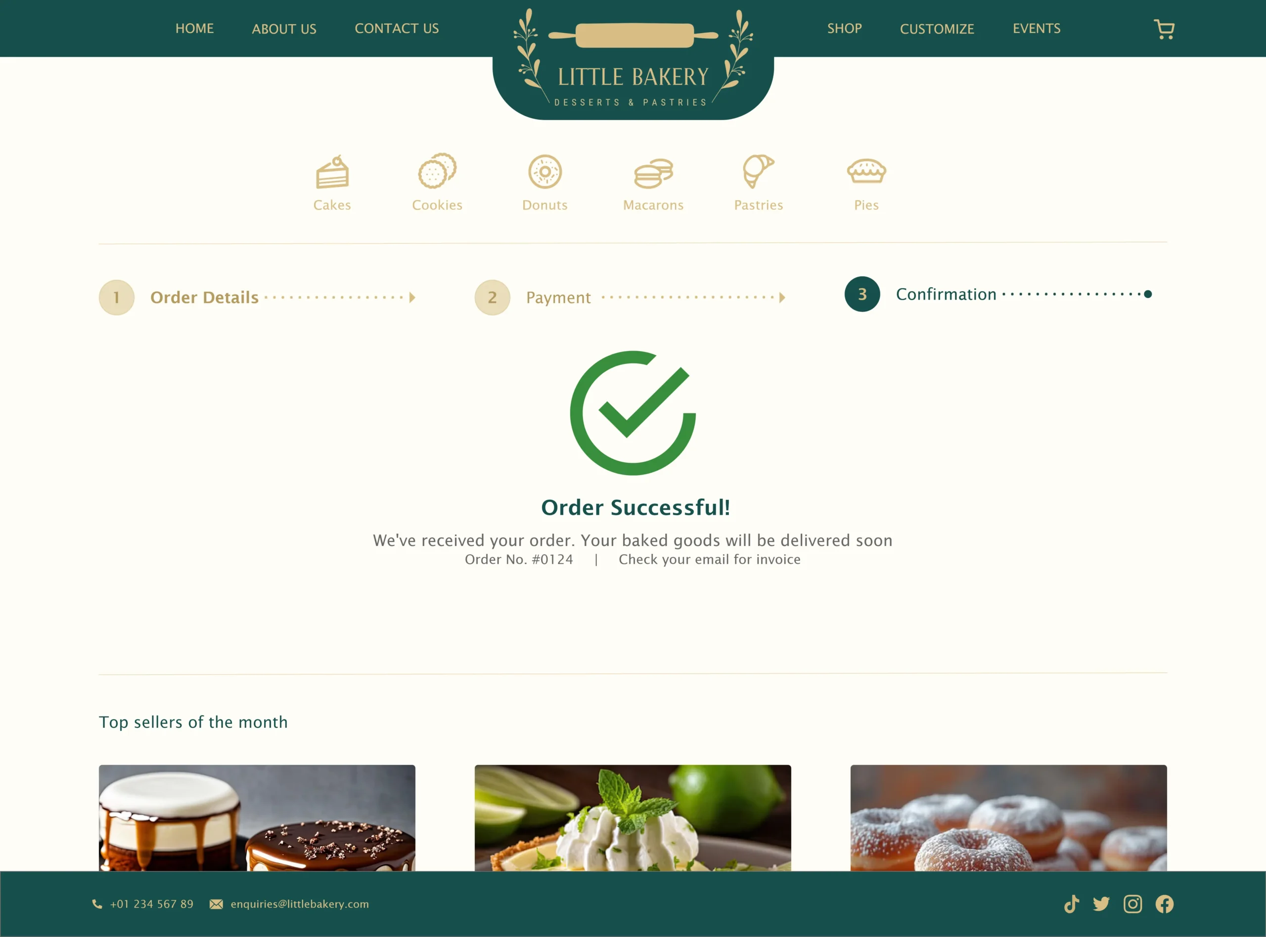
Key Mockups
High-Fidelity Prototype
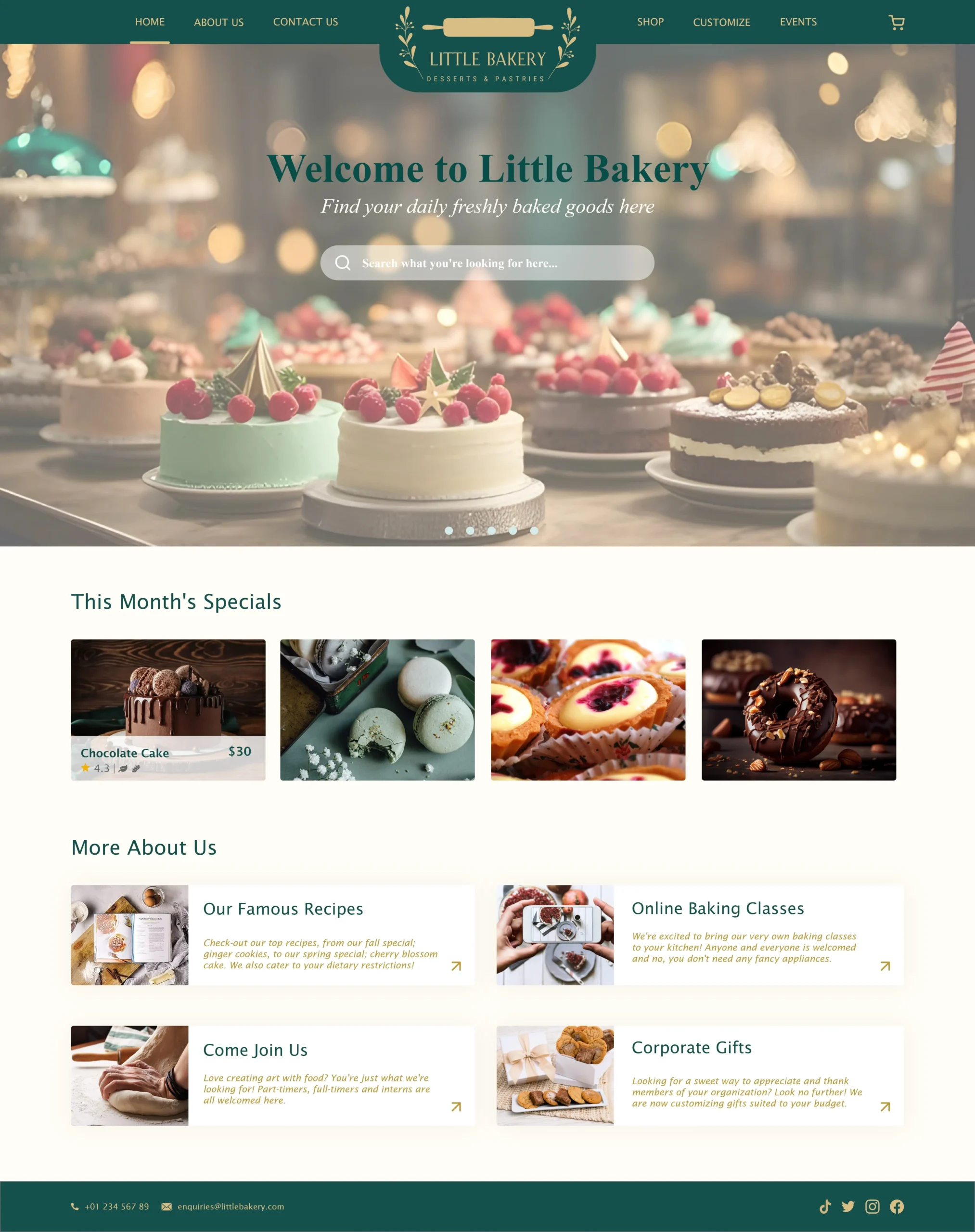
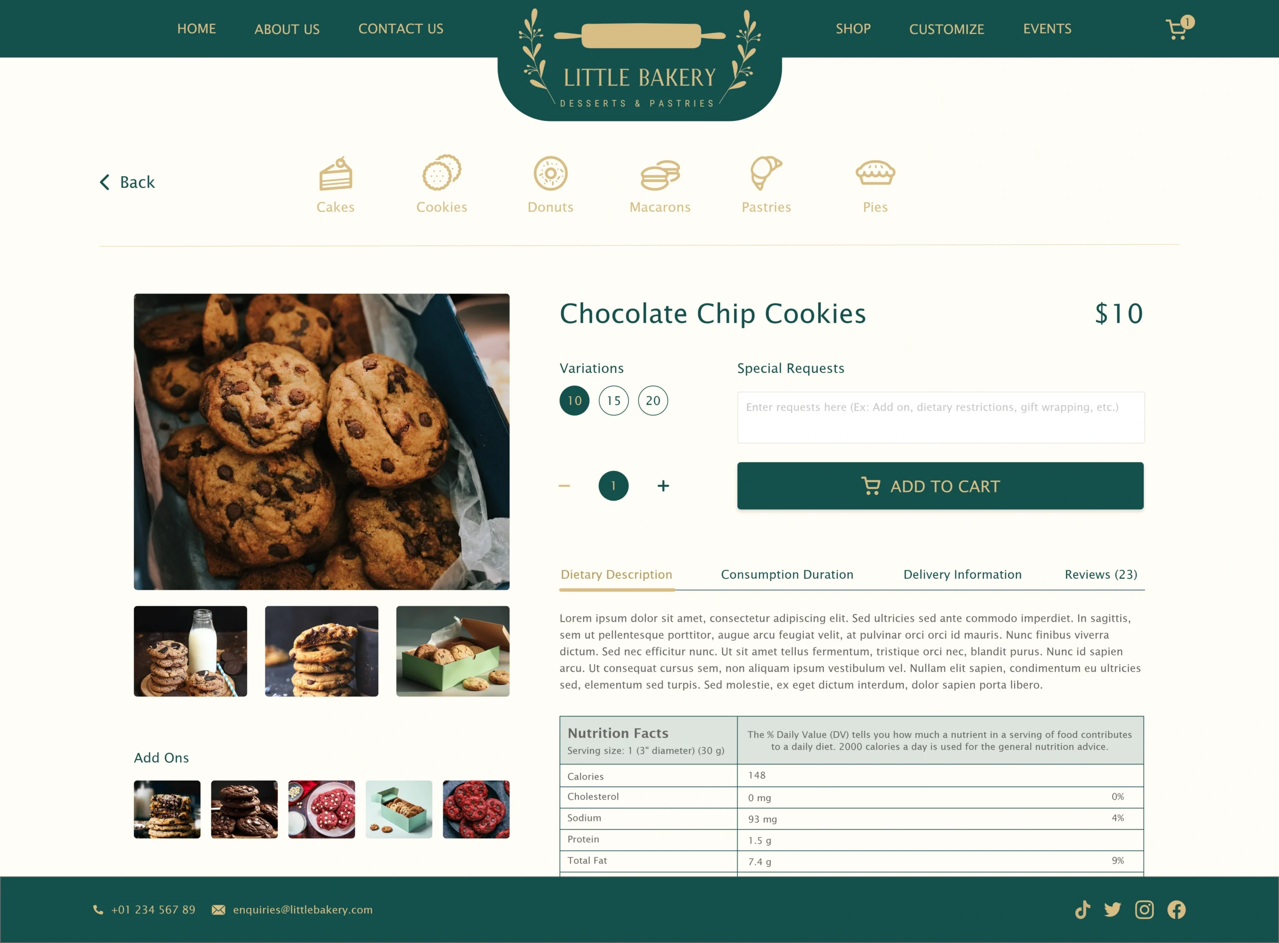
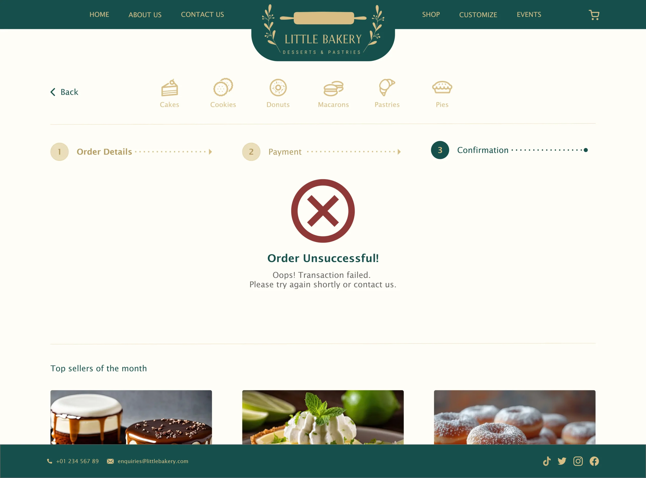
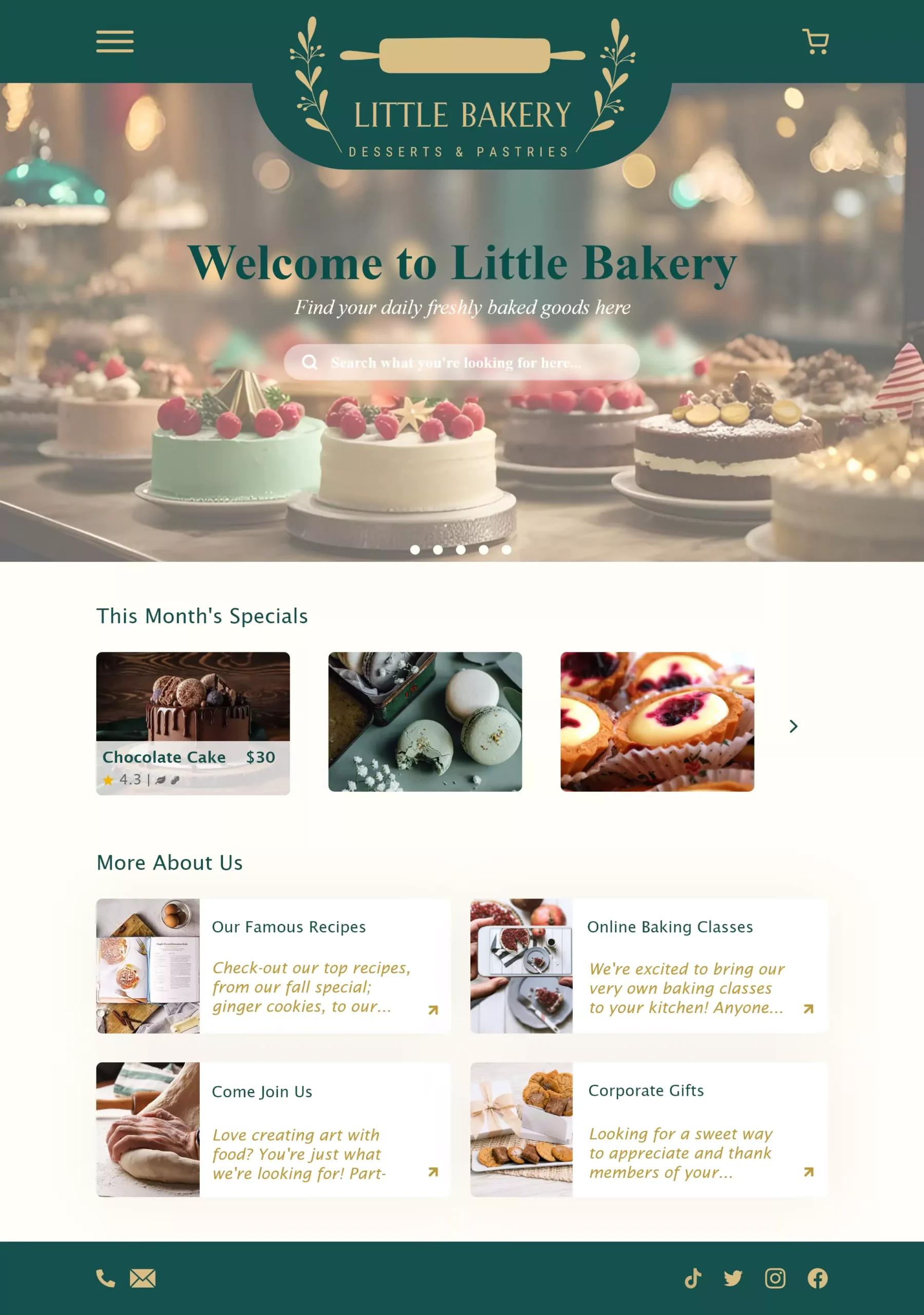
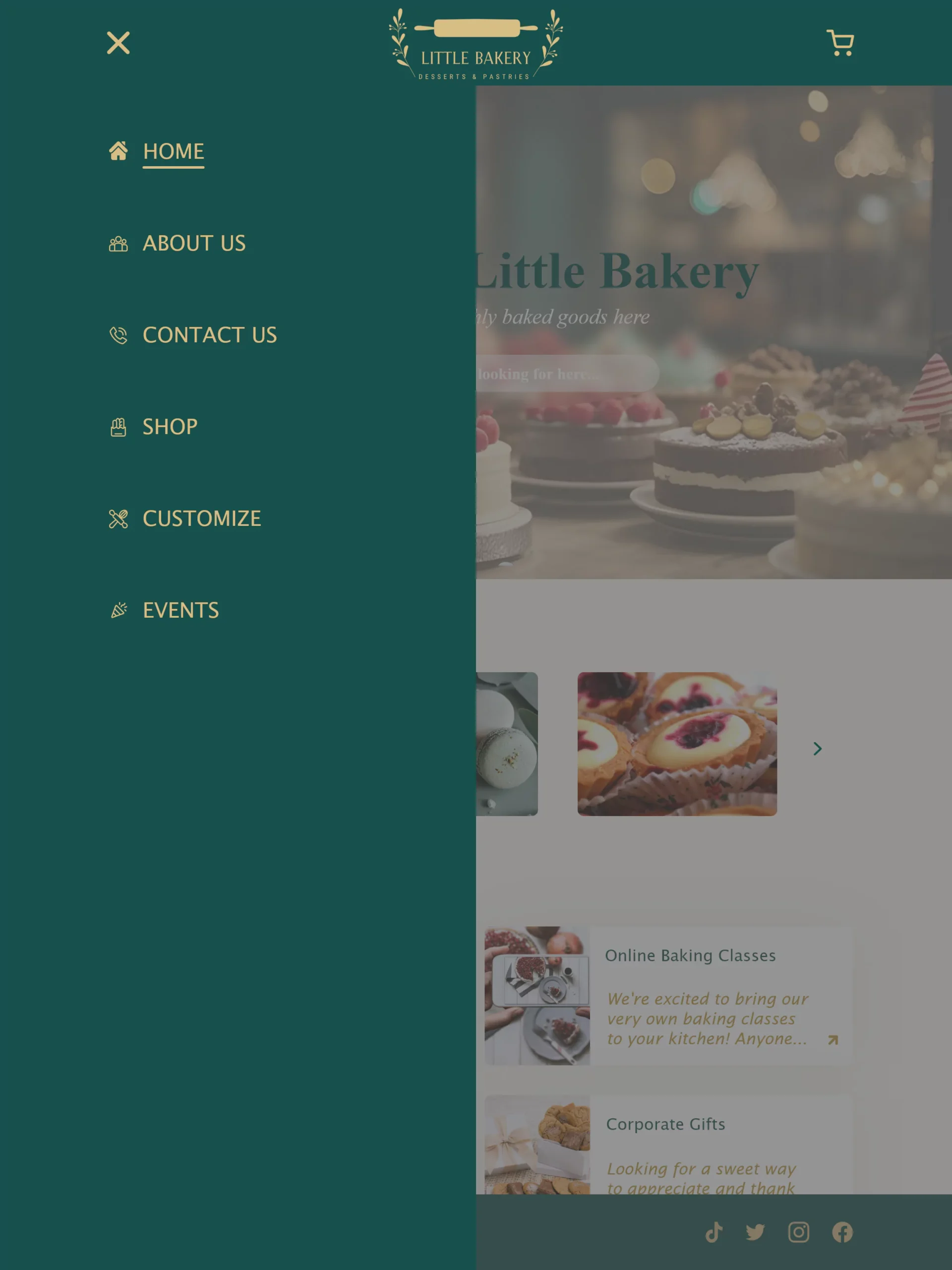
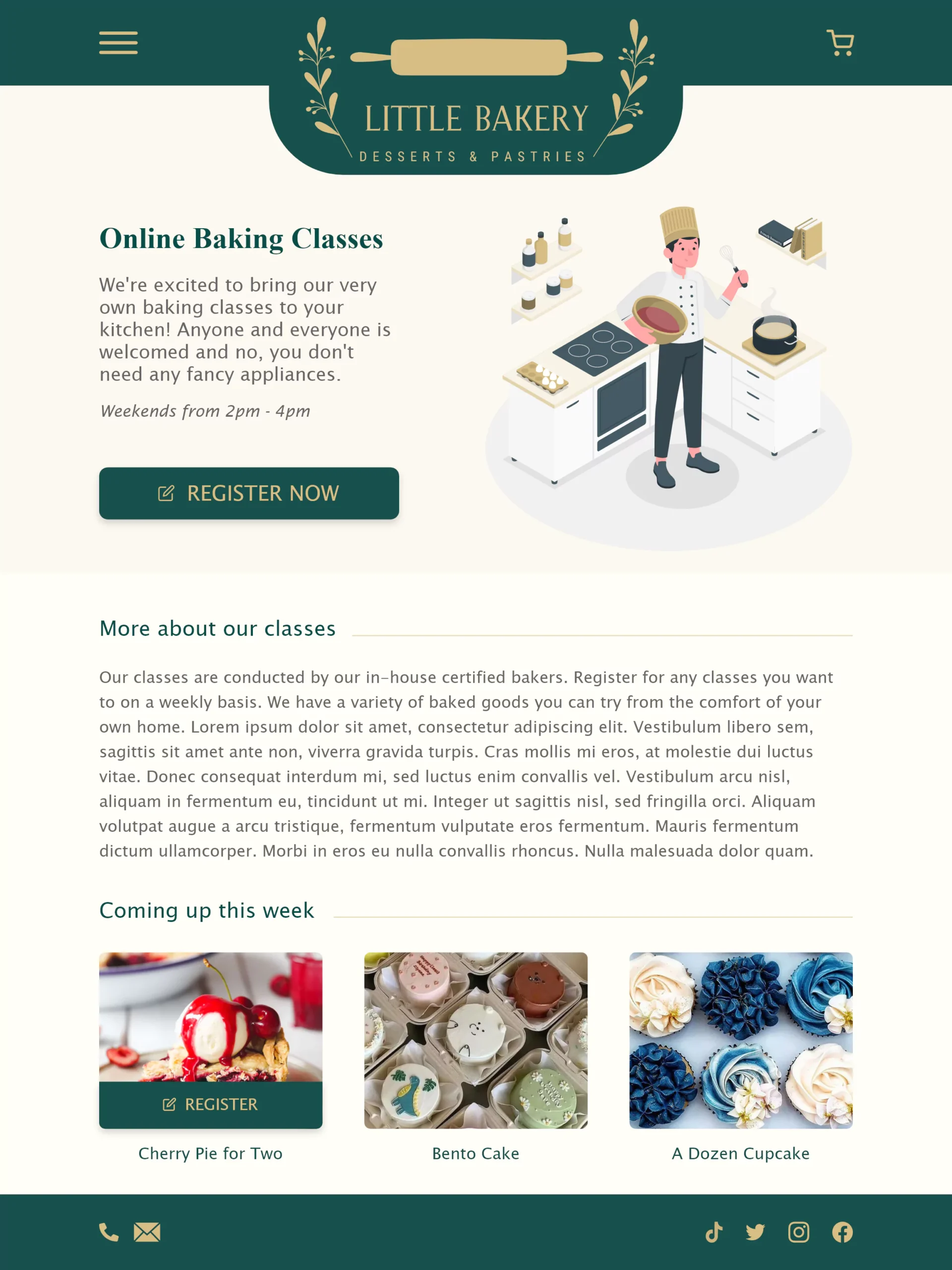
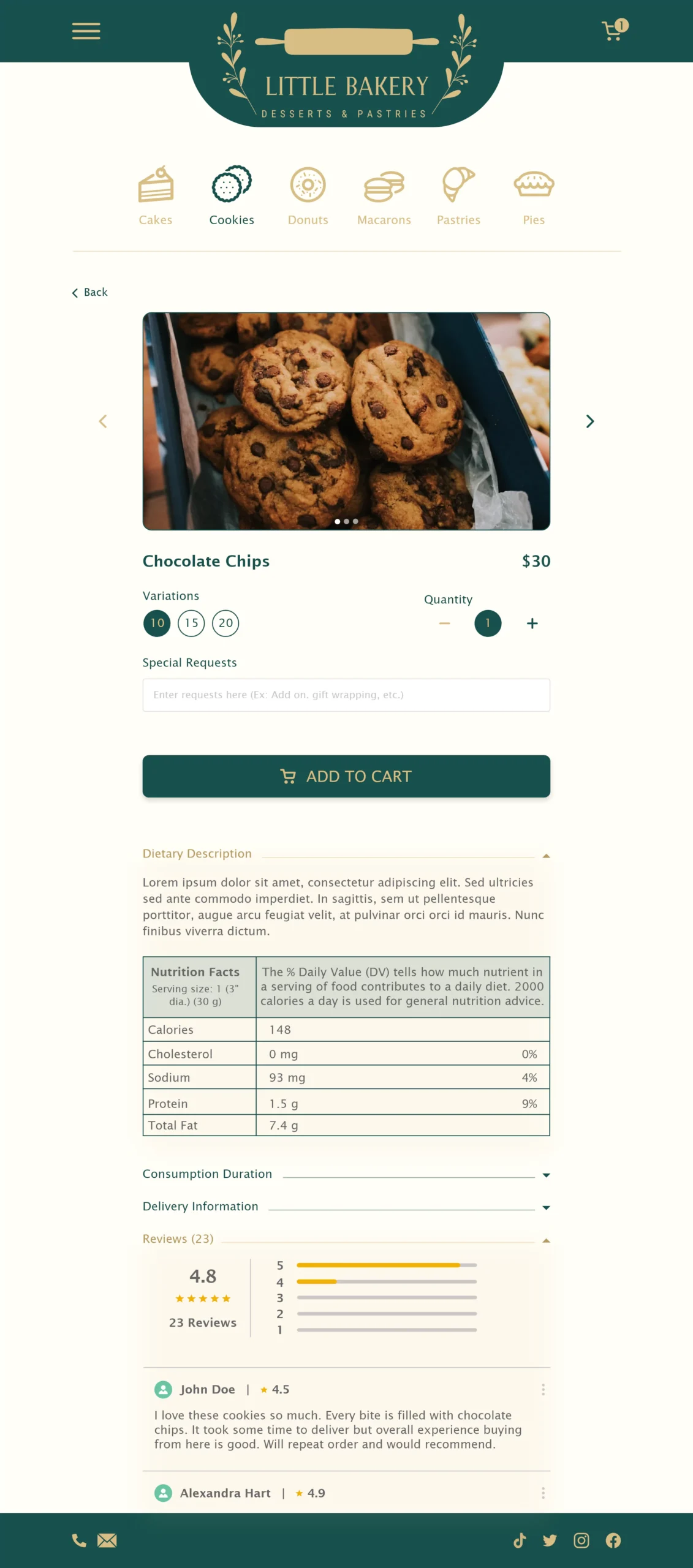
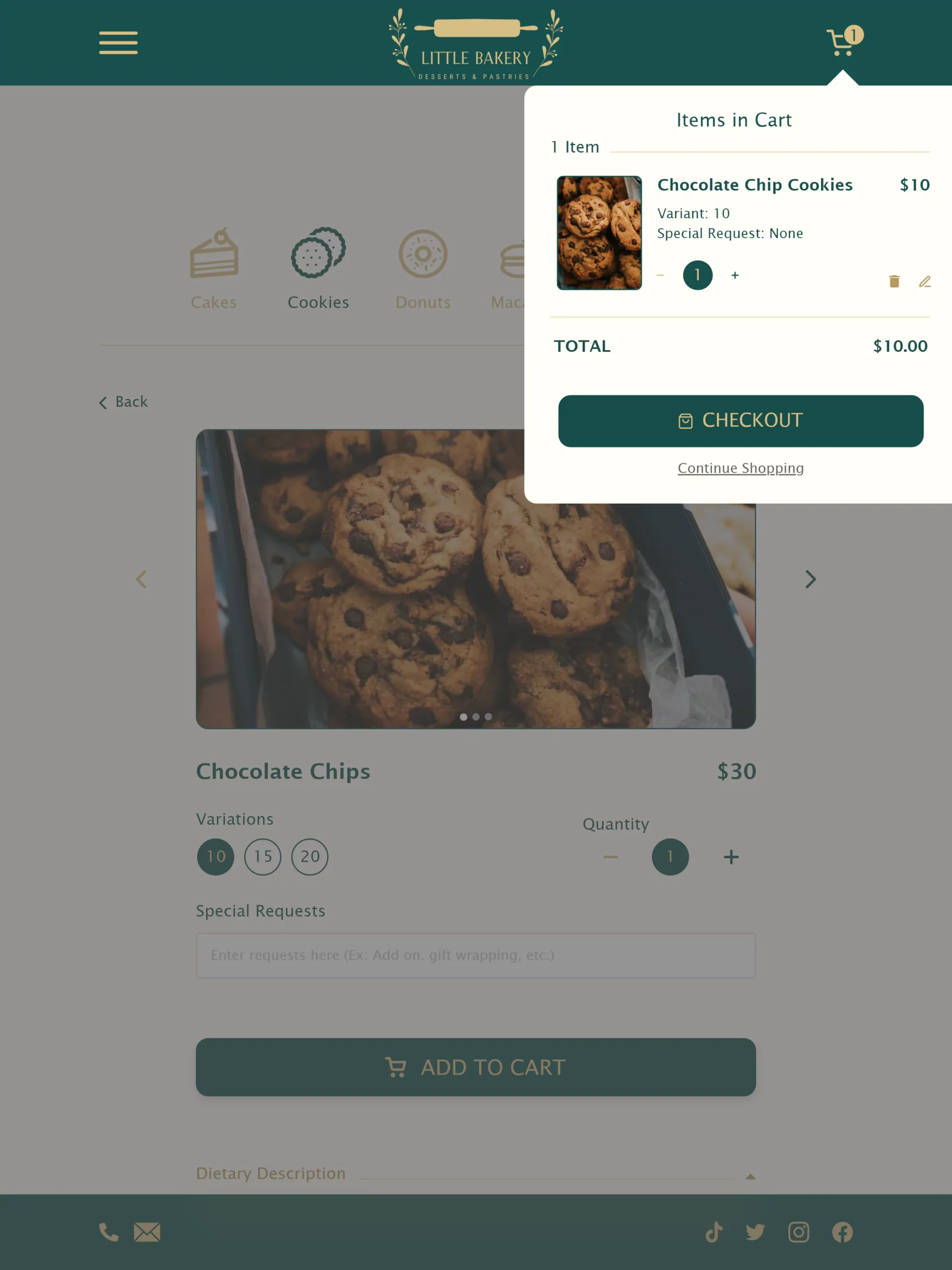
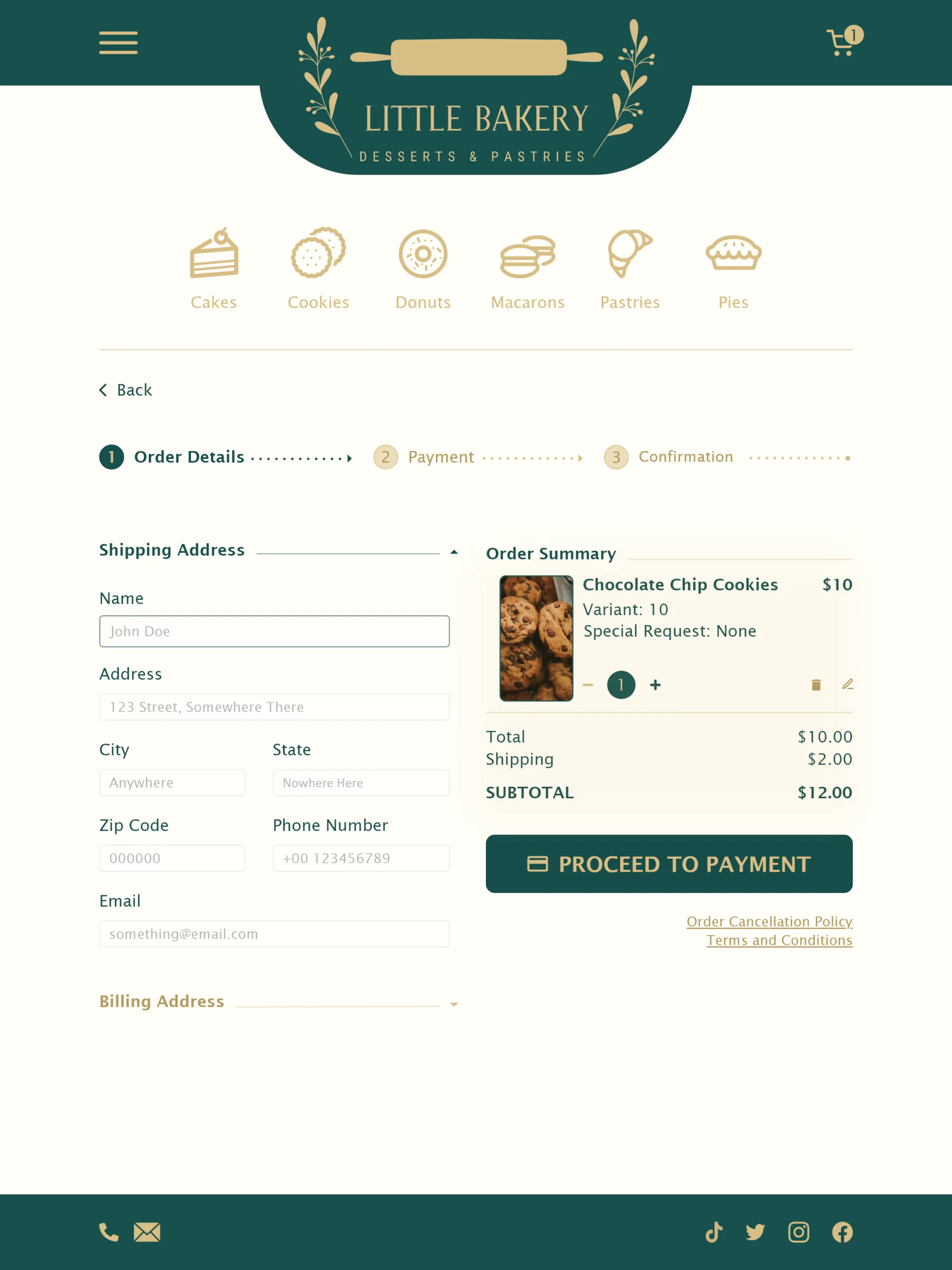
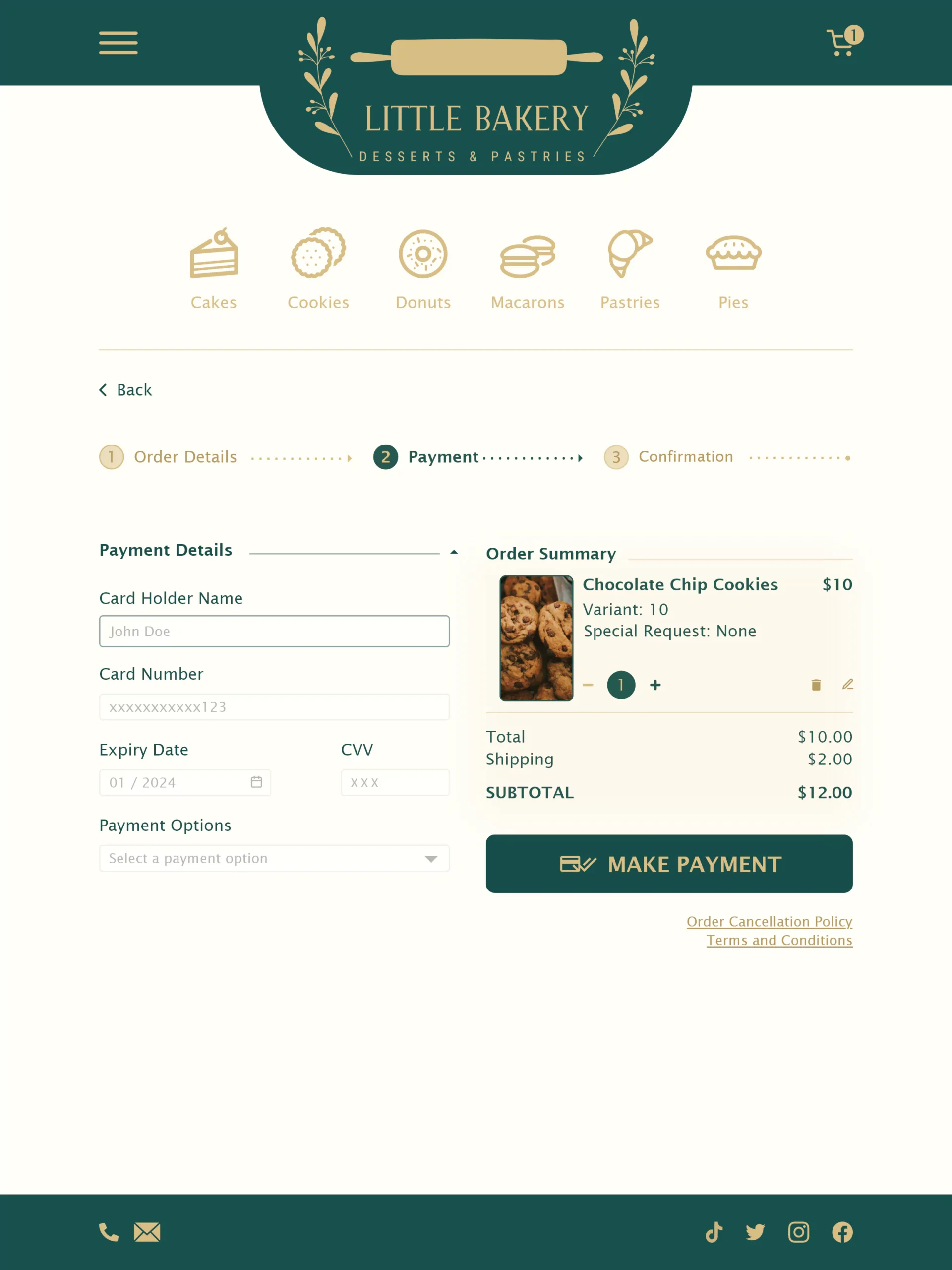
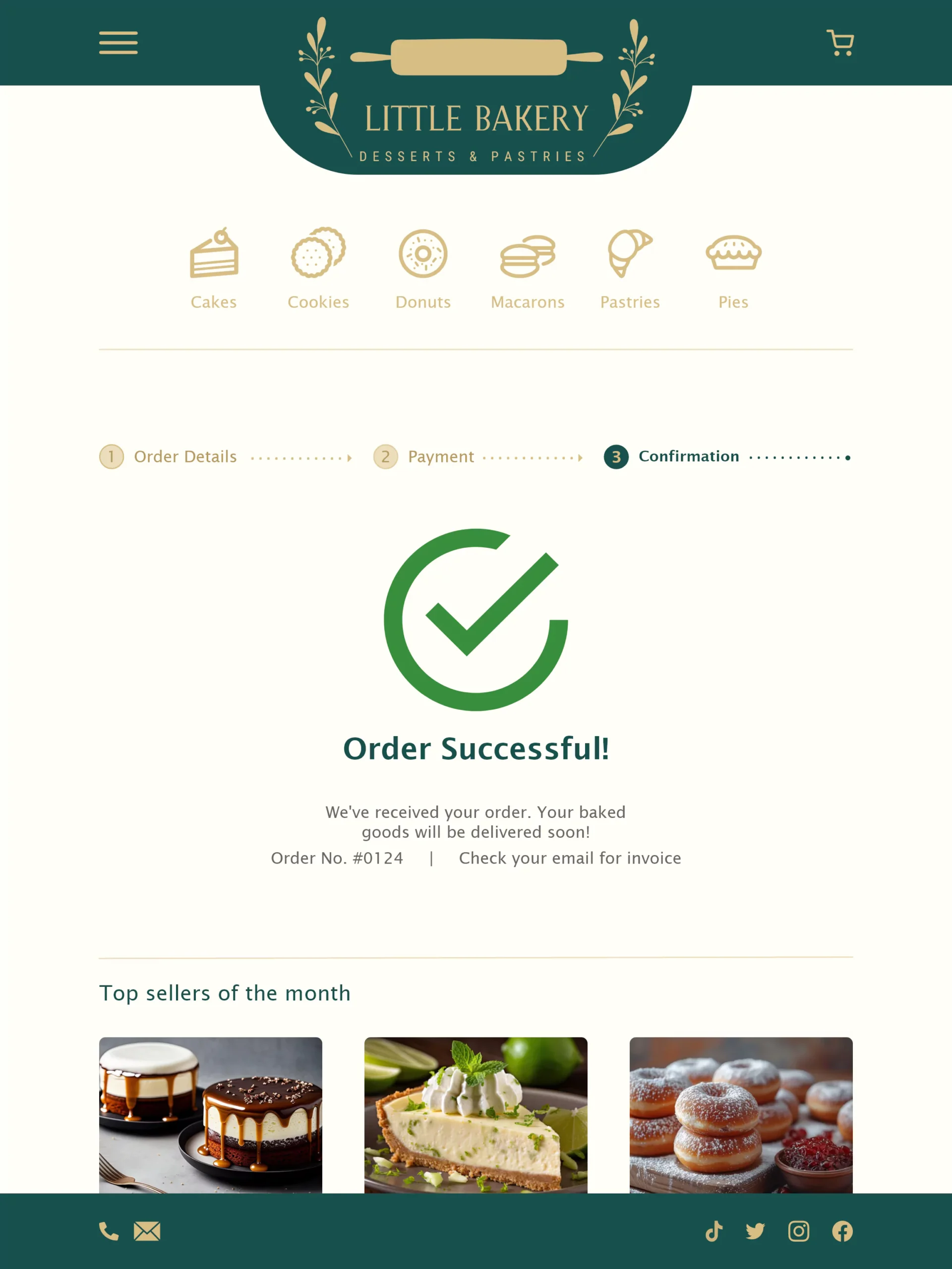
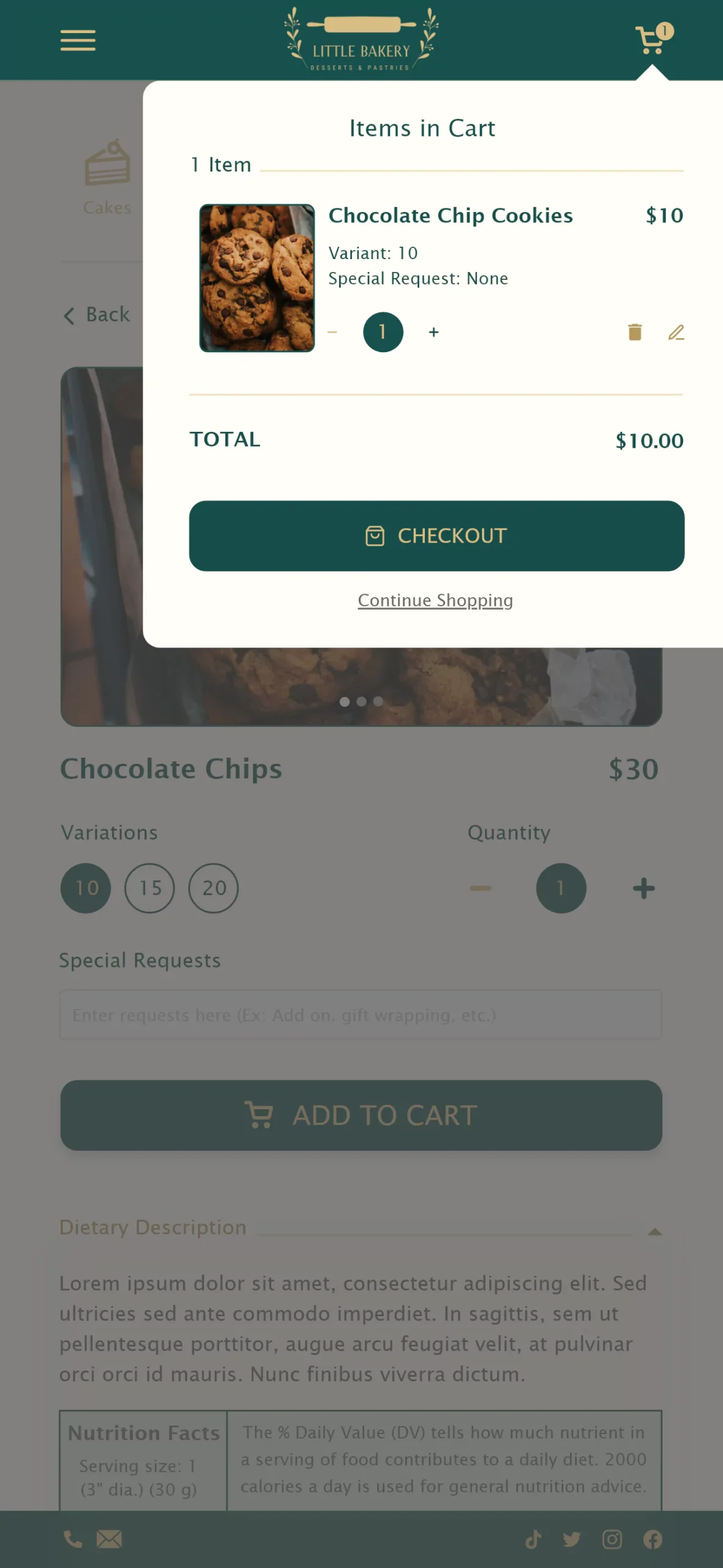
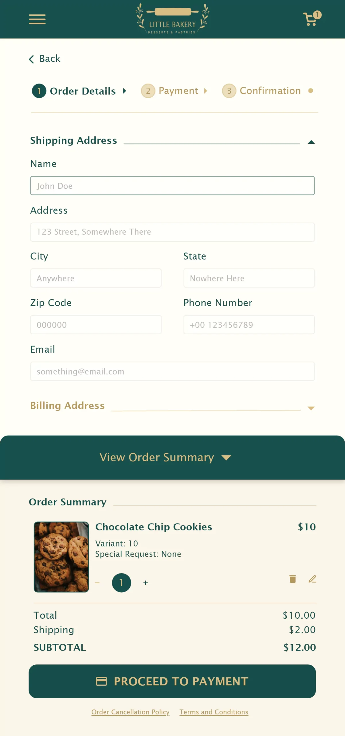
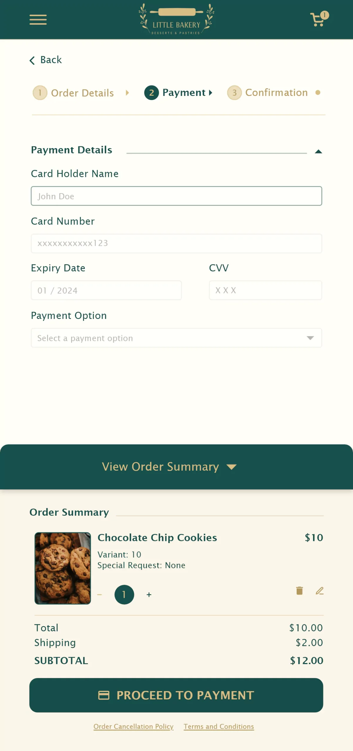
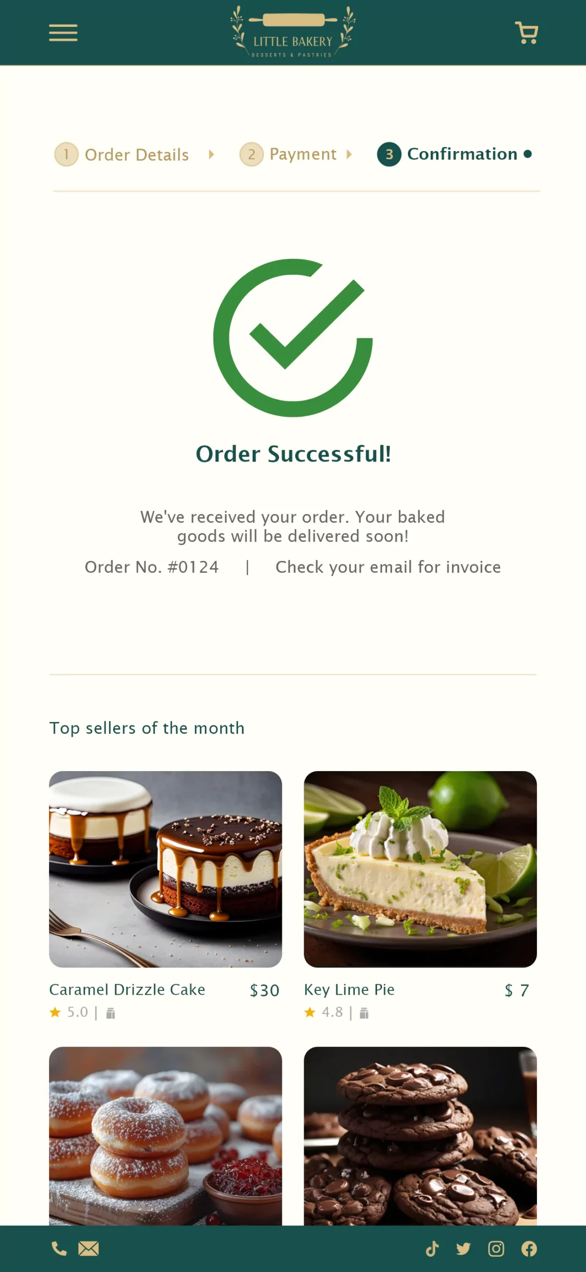
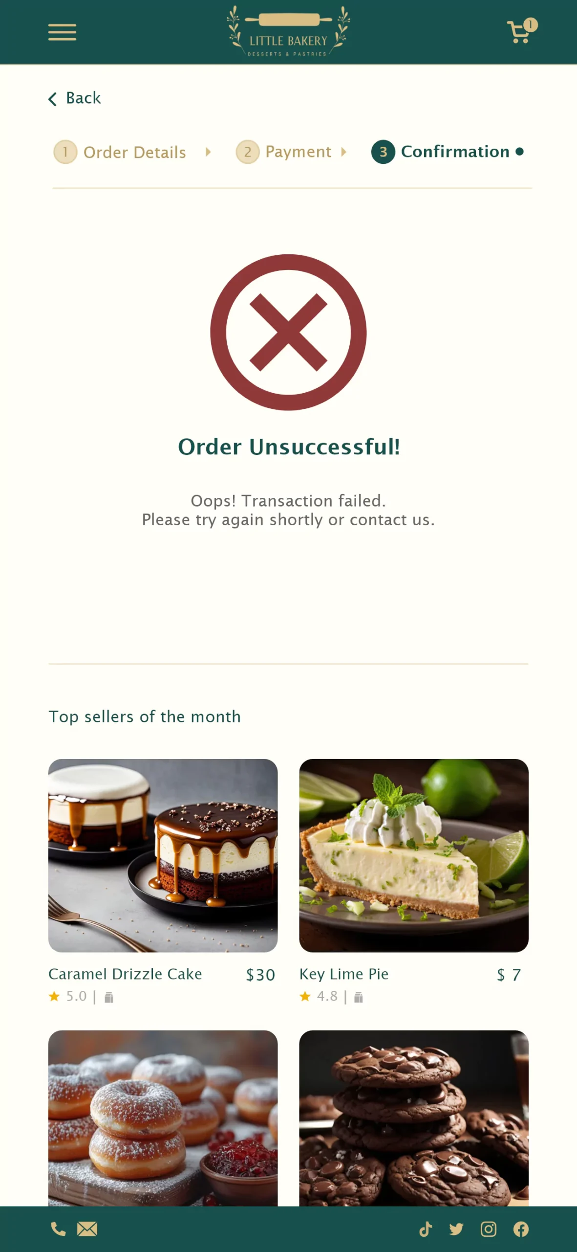
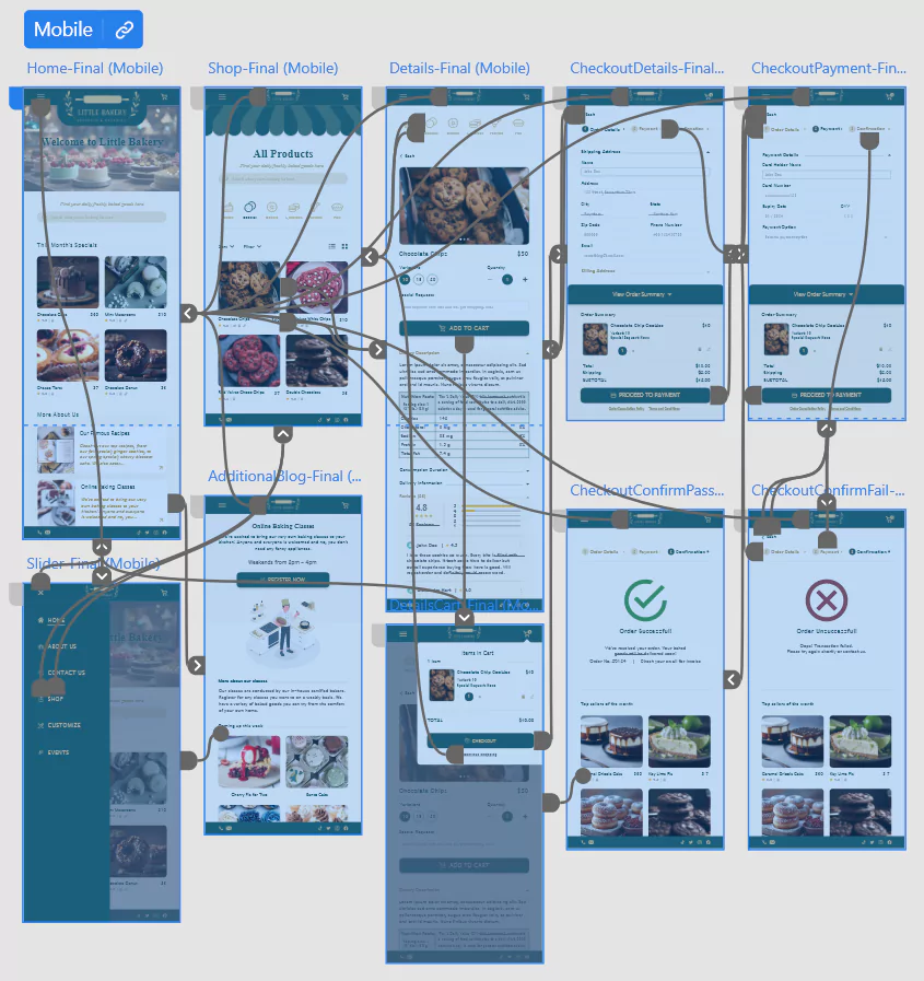
The final high-fidelity prototype presented cleaner user flows for placing an order that’s smooth and easy for customers with back buttons incorporated. It also meets the user needs of categorizing items, selecting payment and delivery options, as well as individual reviews of each item.

The final high-fidelity prototype of Little Bakery is available for viewing at Desktop, Tablet & Mobile.
Sticker Sheet
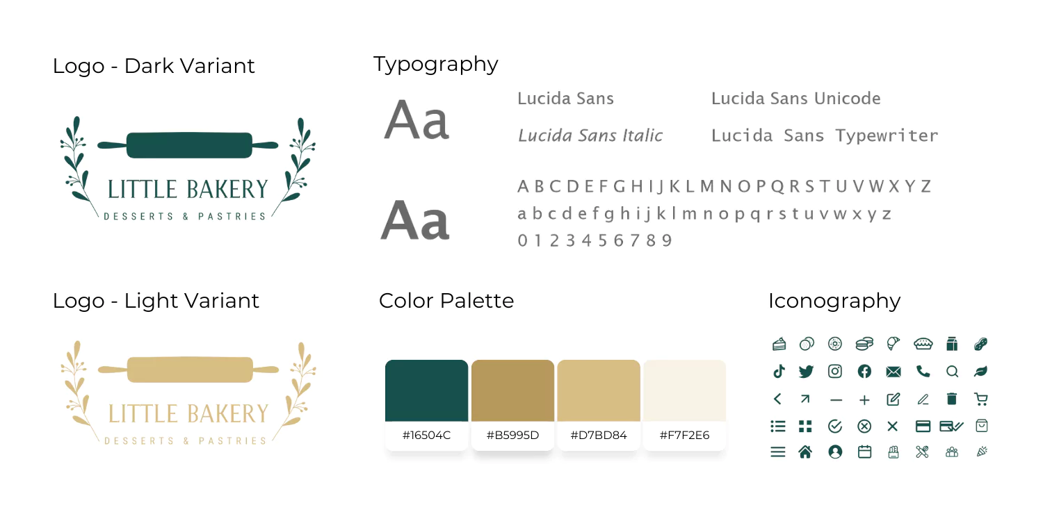
The color palette selected for LittleBakery exudes the refined elegance of the establishment. Drawing from earthly tones, it conveys freshness and speaks to the bakery’s commitment to premium quality. The logo, a harmonious blend of elements, features a rolling pin, emblematic of the handmade desserts and pastries on a daily basis. Delicate foliage on either side further accentuates the theme, symbolizing the freshness inherent in their products.
Accessibility Considerations

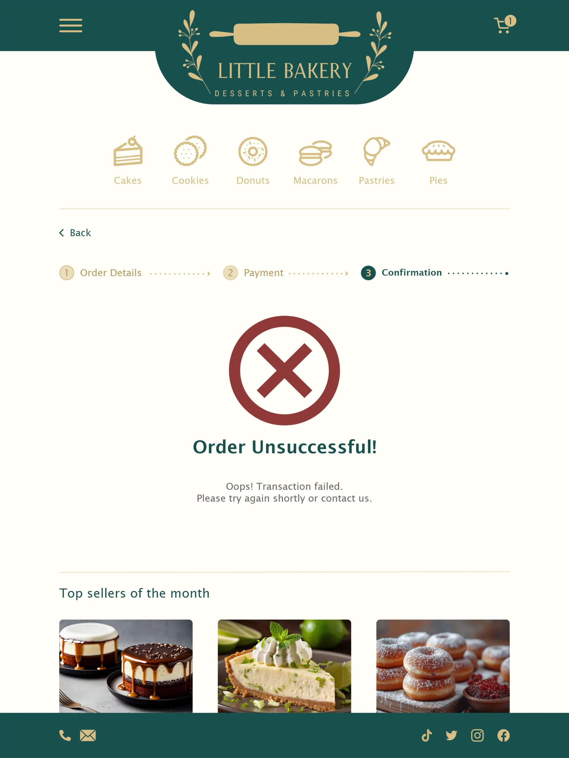
Provided various payment options for foreigners or people who prefer card payments.

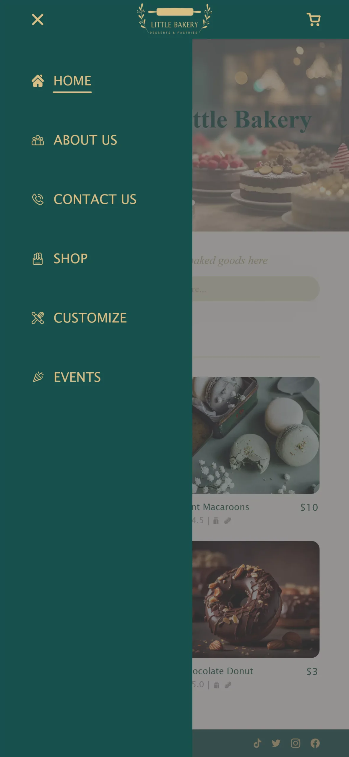
Used labels, icons, and consistent buttons to make navigation and features understandable for people of all age groups.

Provided dietary filters, descriptions and ingredients to cater to people with allergies or restricted diets.

Going Forward

Takeaways

Impact

The online initiative from Little Bakery makes customers feel cared for, especially for people with motion disabilities, and busy schedules. Creating an online responsive platform not only widens the customer base, but also provides customers flexibility of placing an order from anywhere. This would significantly increase sales and help Little Bakery stay in trend with its competitors.

One quote from peer feedback: “I love that I can now satisfy my cravings for Little Bakery goods from the comfort of my home!”

What I learned

Throughout the designing process for this fancy bakery website, I learned the importance of an online platform has in the rapidly growing technological world. To add to that, it is also important to address users’ pain points even if it seems like a minor inconvenience. Feedback and ideas from research conducted, helped to guide through from one iteration to the other until the final responsive website was accomplished.
Next Steps
1
Conduct another round of usability studies to validate whether the pain points users experienced have been effectively addressed.
2
Conduct more user research to determine any new areas of need or pain point that was overlooked before.